Case Study — 02/06
Voly - Rapid Grocery Delivery
Designing the end-to-end mobile experience behind Voly’s promise to deliver groceries in under 15 minutes.
- Role
- Product Designer
- Timeline
- 3 months
- Platform
- iOS & Android
- Status
- Shipped
PROJECT OVERVIEW
Overview
Voly was part of a new wave of rapid grocery services in Sydney, alongside Milkrun and Send. Customers could order everyday essentials and receive them in 15 minutes or less. I designed the customer experience from finding a product to tracking an order to the door. The challenge was to make a large grocery catalogue feel quick and simple without removing the information people need when shopping for food.
- SCOPE
- Mobile e-commerce, grocery discovery, search and categories, product selection, cart, checkout and order tracking.
- RESPONSIBILITIES
- UX and UI design, information architecture, user flows, wireframing, prototyping, visual design, design system and engineering handover.
- TEAM
- Product Manager, Engineers and business stakeholders.
Challenges & Solutions
The promise of a fast delivery shaped the whole experience. Customers needed to find products quickly, build their cart without losing momentum and feel confident that their order was on its way.
01 / 04
Finding products quickly
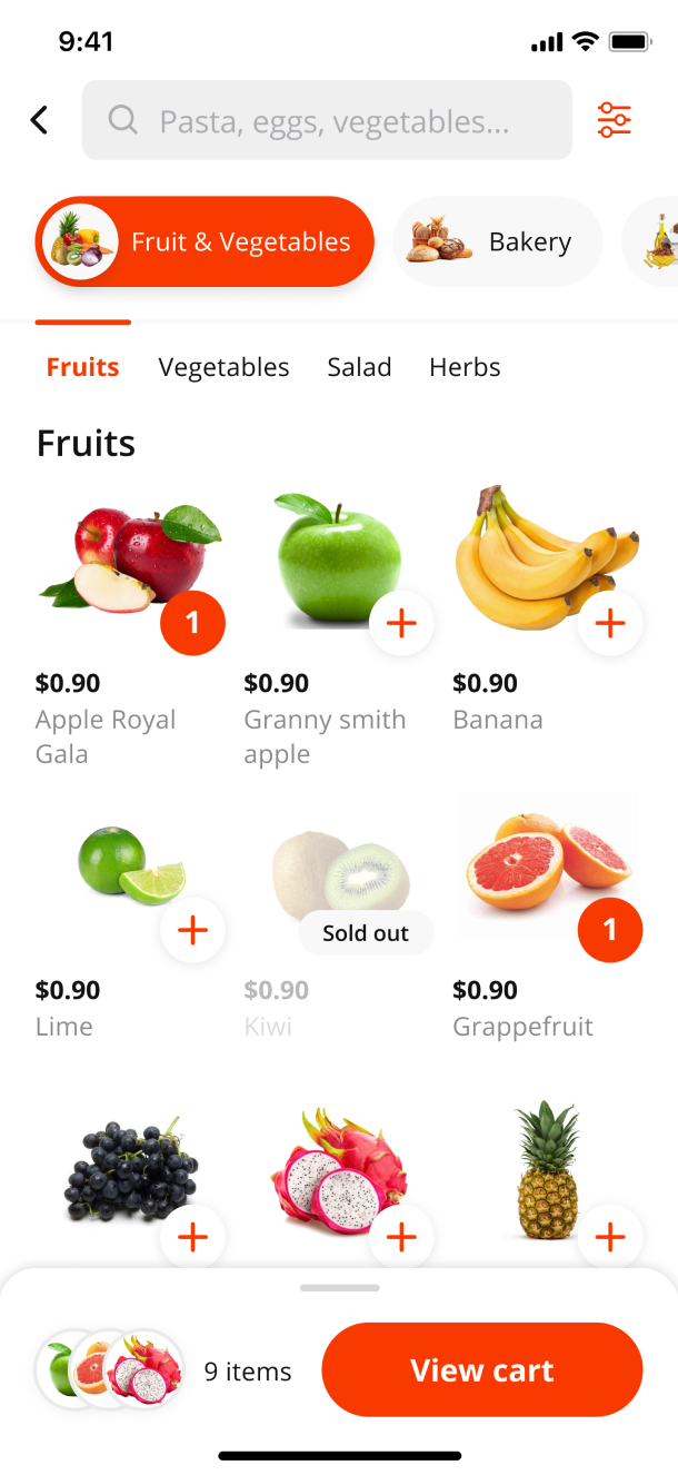
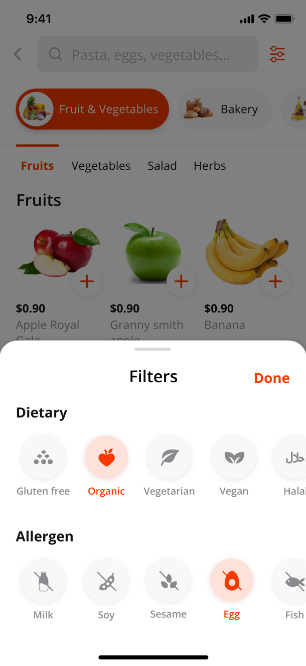
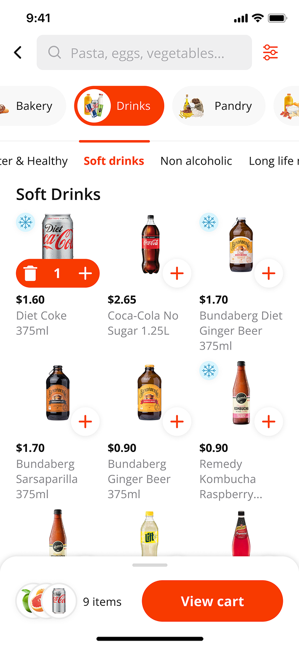
With hundreds of items in the catalogue, customers needed more than one way to reach what they were looking for.
Clearer product discovery
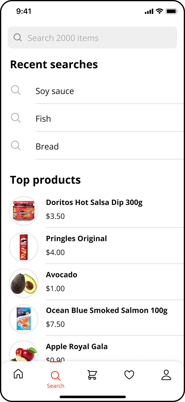
Search, categories and filters worked together, allowing customers to browse or go directly to a specific item.
02 / 04
Building a cart
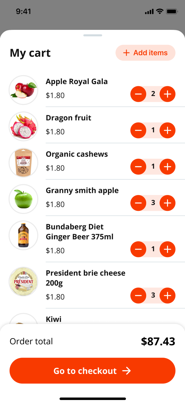
Adding and adjusting products could not interrupt the shopping flow.
Shopping without interruption
Quick actions and a persistent cart kept quantities and totals easy to access while customers continued shopping.
03 / 04
Moving through checkout
A long or unclear checkout would undermine the promise of a 15-minute delivery.
A more focused checkout
The flow focused on delivery details, payment and confirmation without adding unnecessary steps.
04 / 04
Waiting for delivery
Once an order was placed, customers needed to understand what was happening and when it would arrive.
Clear order tracking
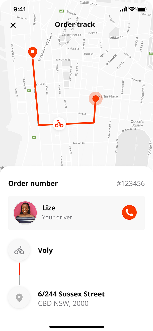
Order statuses and live tracking carried the experience from checkout through to delivery.
Process
The project moved quickly. Over three months, I mapped the main journeys, explored the structure through wireframes and prototypes, and designed the final experience across iOS and Android. As a freelance designer, I worked closely with the team throughout the design phase and prepared the screens, components and documentation for engineering handover.

Structuring the journey
Before designing individual screens, I mapped the journey from opening the app to receiving an order. This helped simplify the catalogue, define the role of search and categories, and remove unnecessary steps between cart and checkout.
Visual Language
The visual language needed to feel energetic without getting in the way of shopping. Strong brand elements were balanced with simple layouts that kept products, prices and actions easy to read.
Colors
Orange was the main brand colour and was used to highlight actions throughout the app. Because it is such a bold and energetic colour, I used it selectively to keep important actions visible without overwhelming the interface. White created breathing room around products, prices and content, helping the app feel lighter and easier to scan.
Typography
Open Sans was used throughout the app for its clarity at small sizes. Its range of weights created a clear hierarchy across product names, prices, labels and long shopping lists.
Getting Started
New customers could create an account through a short sign-up flow or continue as a guest and start browsing straight away. This gave people access to the catalogue without forcing registration too early, while keeping account creation simple for those ready to order.
Problems
- Mandatory account creation
- Lengthy registration form
- Poor visual hierarchy
WHAT CHANGED
- Introduced guest browsing
- Reduced sign-up to 3 steps
- Clarified the entry options
A home screen built for fast shopping
The home screen prioritised the actions shoppers used most: searching for a specific item, entering a category, discovering relevant products and checking their cart as it grew.
Featured content
A focused space for promotions, seasonal ranges and important service updates.
Suggestions
Relevant products helped customers discover useful additions without interrupting the main shopping journey.
Categories
Visual category shortcuts gave customers a faster way into a large grocery catalogue.
Cart
The cart remained visible throughout the experience, making it easy to review the total or continue to checkout.
Product details
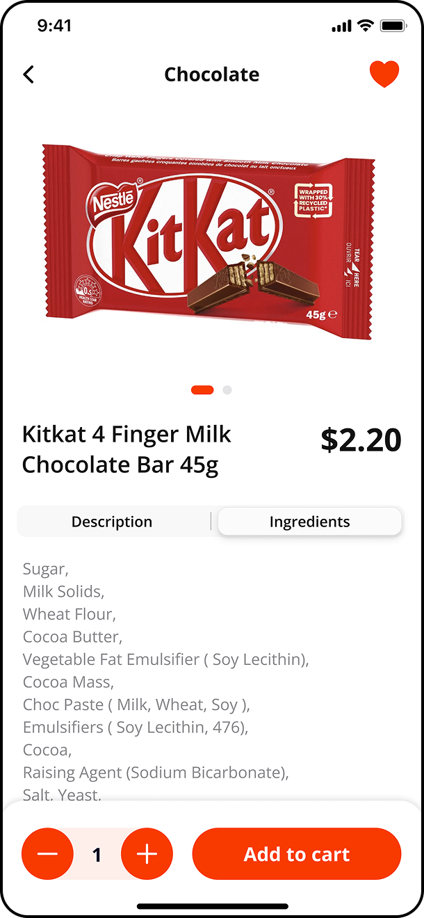
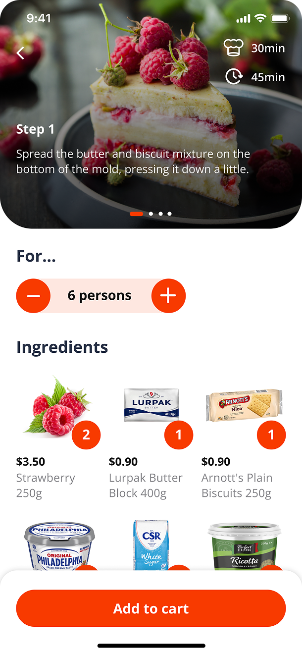
Giving customers enough information to decide. The product page brought the information customers needed into one clear view, including price, quantity, ingredients and product details. Clear product imagery and a strong information hierarchy made the page easier to scan, while the add-to-cart action remained prominent and easy to reach.
Problems
- Product details were hard to scan
- Price and quantity lacked hierarchy
- Add to cart was easy to miss
WHAT CHANGED
- Simplified the product information
- Clarified price and quantity
- Made add to cart more prominent
Keeping the experience clear after shopping
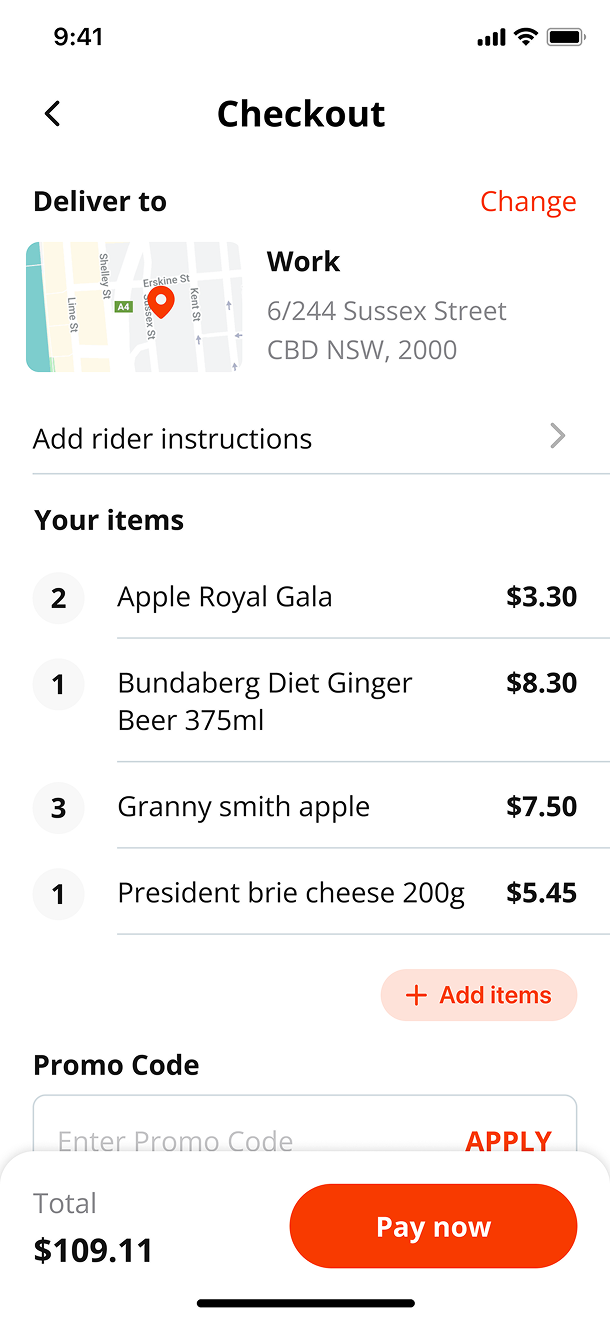
Once customers were ready to order, the checkout focused on the information needed to complete the purchase: delivery details, payment and confirmation. After checkout, clear order statuses and live tracking reassured customers that their groceries were on the way and helped manage expectations around the 15-minute delivery promise.
Problems
- Too many steps before placing an order
- Limited visibility after checkout
- High expectations around the 15-minute delivery promise
WHAT CHANGED
- Kept checkout focused on delivery and payment
- Created clear order statuses from confirmation to arrival
- Added live tracking so customers could follow their delivery
Across the experience
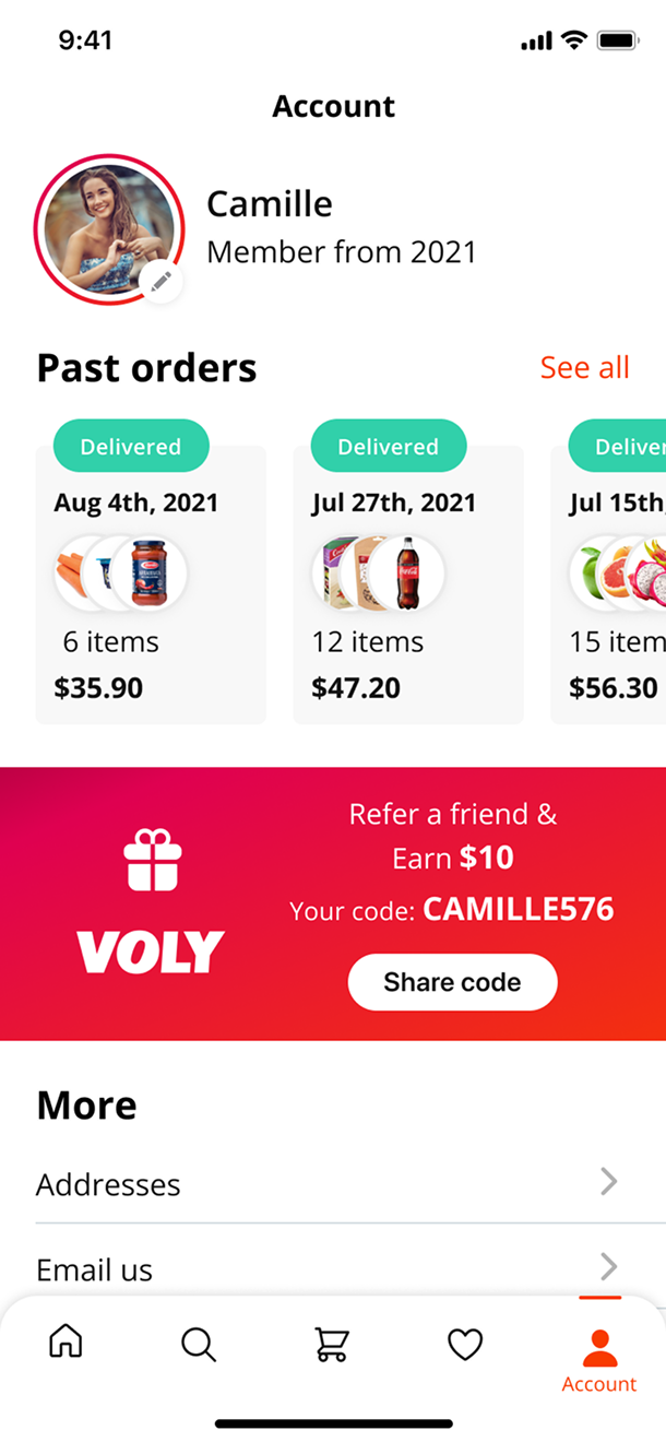
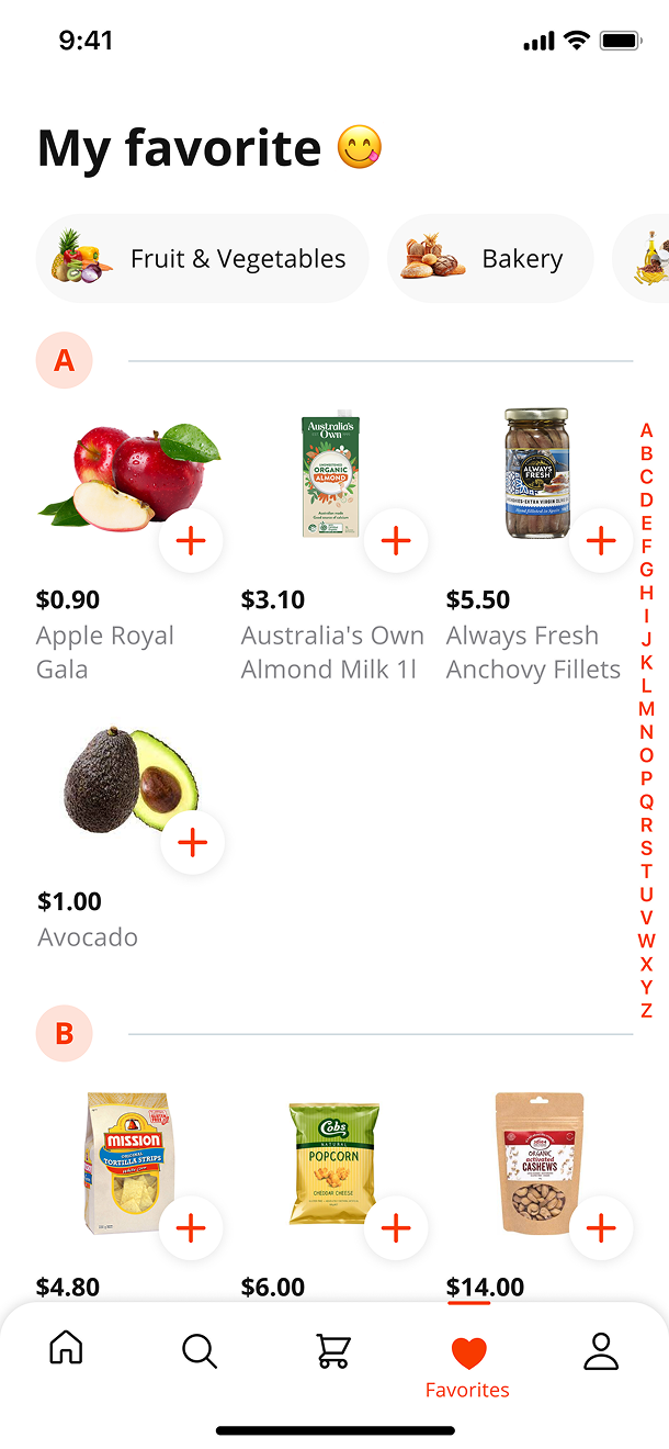
Beyond the main shopping flow, the wider experience included account management, favourites, recipes, checkout, search and live order tracking. Each screen used the same components and interaction patterns, keeping the product familiar from the first browse through to delivery.

A complete foundation for fast grocery shopping
The redesigned app connected discovery, shopping, checkout and live order tracking into one consistent mobile experience built around Voly’s promise of speed.
Faster Shopping
Search, categories, quantity controls and a simplified checkout helped remove small moments of friction throughout the shopping journey.
End-to-End Experience
The customer journey was redesigned from opening the app through to receiving an order, rather than treating individual screens as separate features.
Built to Continue
A reusable component library and documented interaction patterns gave the team a consistent foundation to develop the product after handover.
Before
The experience lacked a consistent structure across the full shopping journey.
After
Customers could move from product discovery to checkout and live tracking through one connected experience designed around speed and clarity.