Case Study — 03/06
Prezzee — Gift Card App
Led UX and UI design for the rebuild of Prezzee’s e-commerce website and native app. This case study focuses on the mobile experience.
- Role
- UX/UI Designer
- Timeline
- 6 months
- Platform
- Web, iOS & Android
- SCALE
- 100K+ users
- Status
- Live product
PROJECT OVERVIEW
Overview
Prezzee was redesigning its brand, e-commerce website and native mobile app as part of a broader product transformation. I led UX and UI design across web and mobile, from early product definition through to delivery. The work focused on simplifying how customers discover, personalise, send, store and redeem digital gift cards, while creating a flexible framework that allowed partner brands to retain their identity.
- SCOPE
- E-commerce website, native mobile app, gift card discovery, gifting flow, checkout, wallet and redemption.
- RESPONSIBILITIES
- Product strategy, UX and UI design, information architecture, user flows, prototyping, component library, developer handoff and design QA.
- TEAM
- CEOs, Product Manager, Engineers.
Challenges & Solutions
Prezzee needed to improve a purchase journey that was creating unnecessary friction at checkout. Product data also showed that customers were buying gift cards for very different reasons. I focused on separating those purchase intentions, reducing unnecessary steps and creating an experience that could scale consistently across hundreds of partner brands.
01 / 03
One journey for two different intentions.
Customers buying for themselves needed speed, while customers buying for someone else needed time to personalise the experience. Both were being pushed through the same gifting flow.
Split the flow by purchase intent
From the card details screen, customers could choose to buy for themselves and move directly to checkout, or continue into a dedicated gifting journey.
02 / 03
Five steps before checkout.
The gifting journey required five steps before payment, making a relatively simple purchase feel longer and adding friction at the most important point in the experience.
Reduce gifting from five steps to three
I grouped related information together and reduced the journey to three clear decisions: choose a greeting card, add the recipient details and message, then review and pay.
03 / 03
Hundreds of partner brands, one product.
The simplified purchase journey still needed to work consistently across hundreds of gift cards while allowing each partner’s artwork and visual identity to remain recognisable.
One scalable framework
I created a shared product structure that kept navigation, interactions and hierarchy consistent while giving each partner brand enough space to retain its own identity.
Process & Structure
From insight to release.
I worked across three overlapping phases rather than treating discovery, design and delivery as separate handoffs. Product data and stakeholder input informed the product structure, while the design system and interface evolved in parallel. Collaboration with engineering continued throughout implementation and design QA.
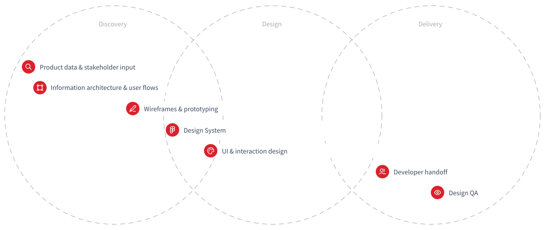
DISCOVERY · DESIGN · DELIVERY
User Flows
Turning product data into two purchase paths.
Product data showed that many customers were buying gift cards for themselves, yet every user was being directed through the same five-step gifting flow. From the card details screen, I introduced a direct path to checkout for self-purchases and reduced the gifting journey from five steps to three.
TWO INTENTIONS · SELF-PURCHASE · GIFTING

Visual Language
A cleaner foundation for the product.
Colors
Prezzee’s visual identity relied heavily on a textured beige background that appeared across much of the product. I replaced it with a cleaner white foundation, gave the signature red a more focused role and introduced a deep slate tone to strengthen hierarchy across web and mobile. This created a clearer interface while giving partner card artwork, colours and imagery more space to stand out.
Typography
I chose Sofia Pro as Prezzee’s core typeface for its balance of clarity, warmth and versatility. Its clean geometric forms made navigation, prices and transactional information easy to scan, while its softer character helped the experience feel approachable rather than overly financial or corporate.
How to Start
A sign-up designed to reduce perceived effort.
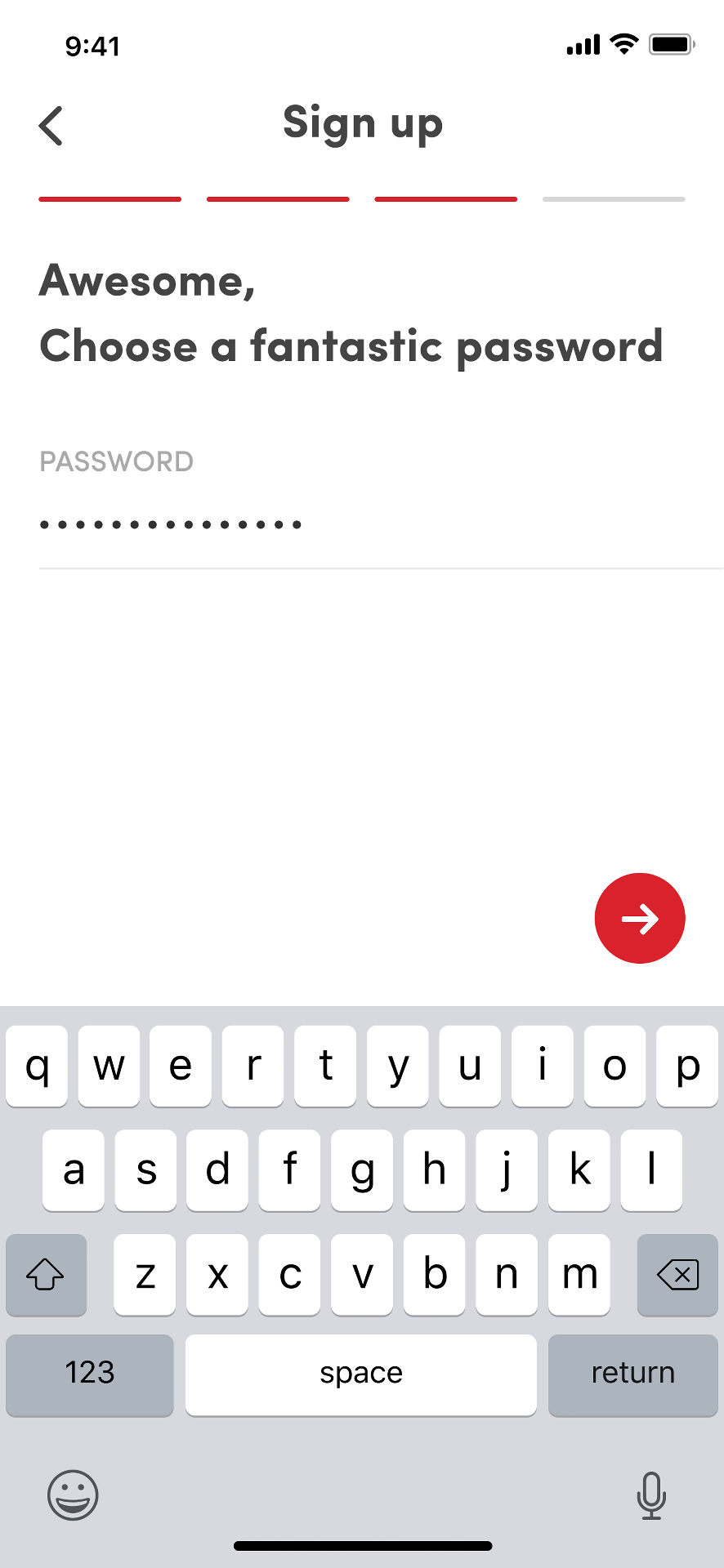
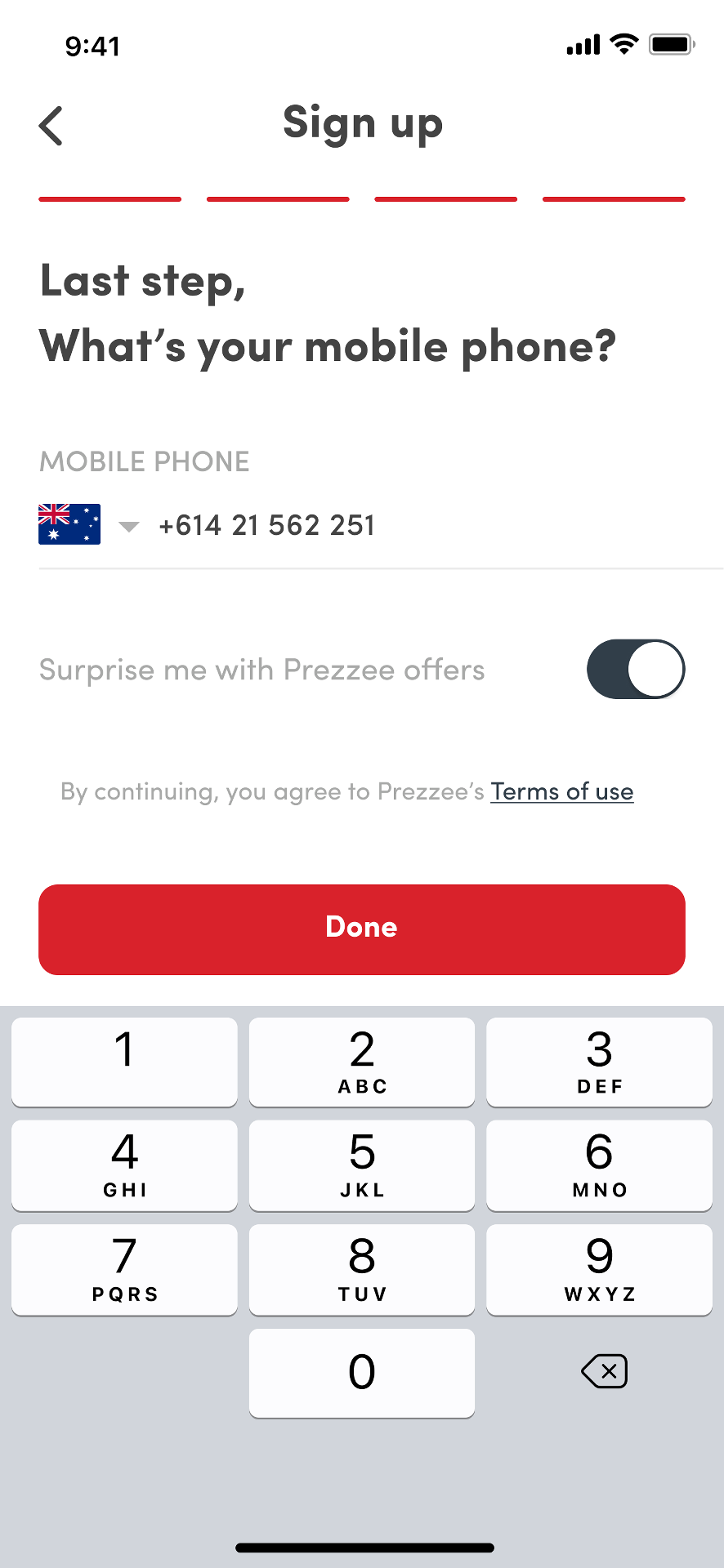
Account creation was broken into one question per screen, reducing the amount of information users had to process at once. The flow reused the customer’s name and showed visible progress between steps, creating continuity and making the experience feel shorter and more personal.
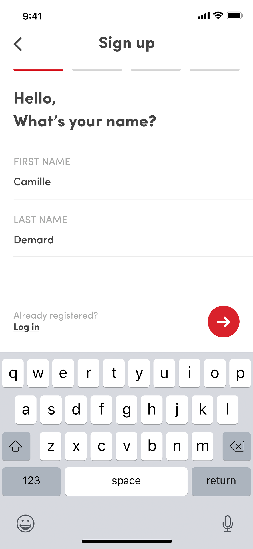
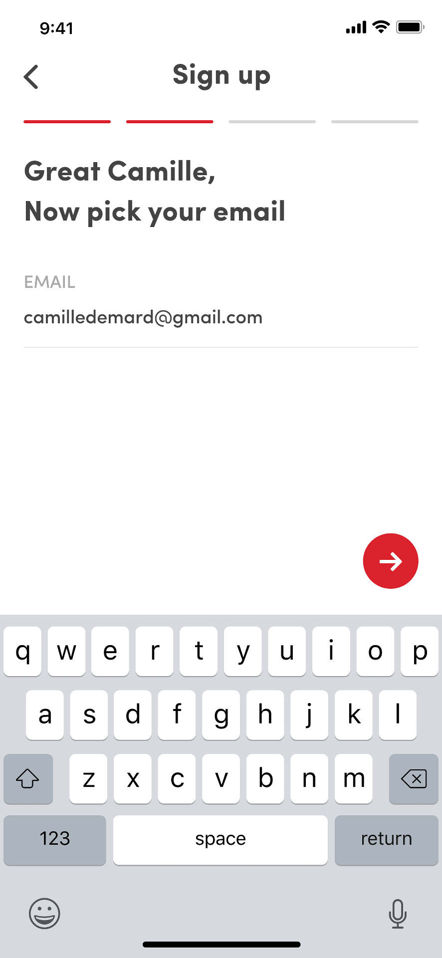
ONE QUESTION PER SCREEN · NAME REUSED THROUGHOUT · VISUAL PROGRESS
The Main Screen
Helping customers find the right gift card.
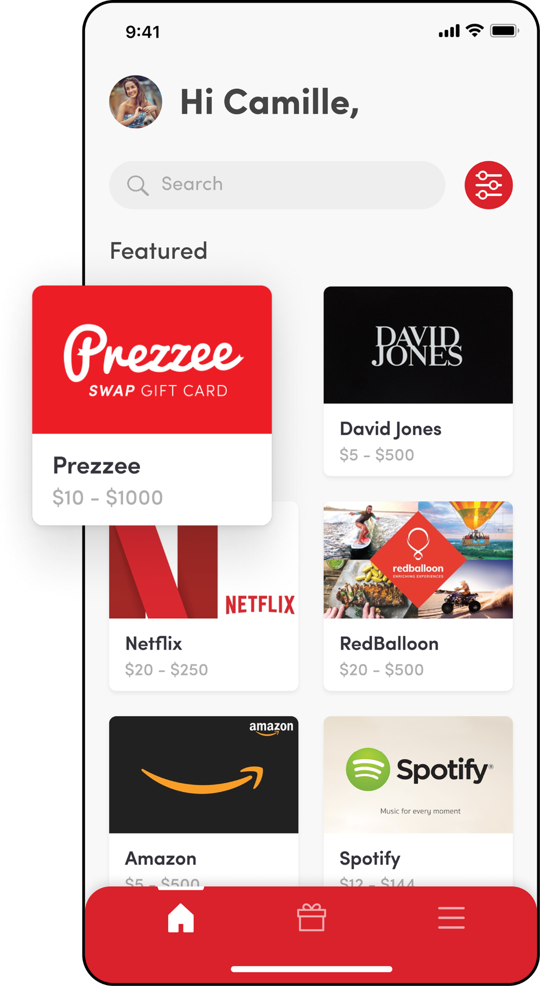
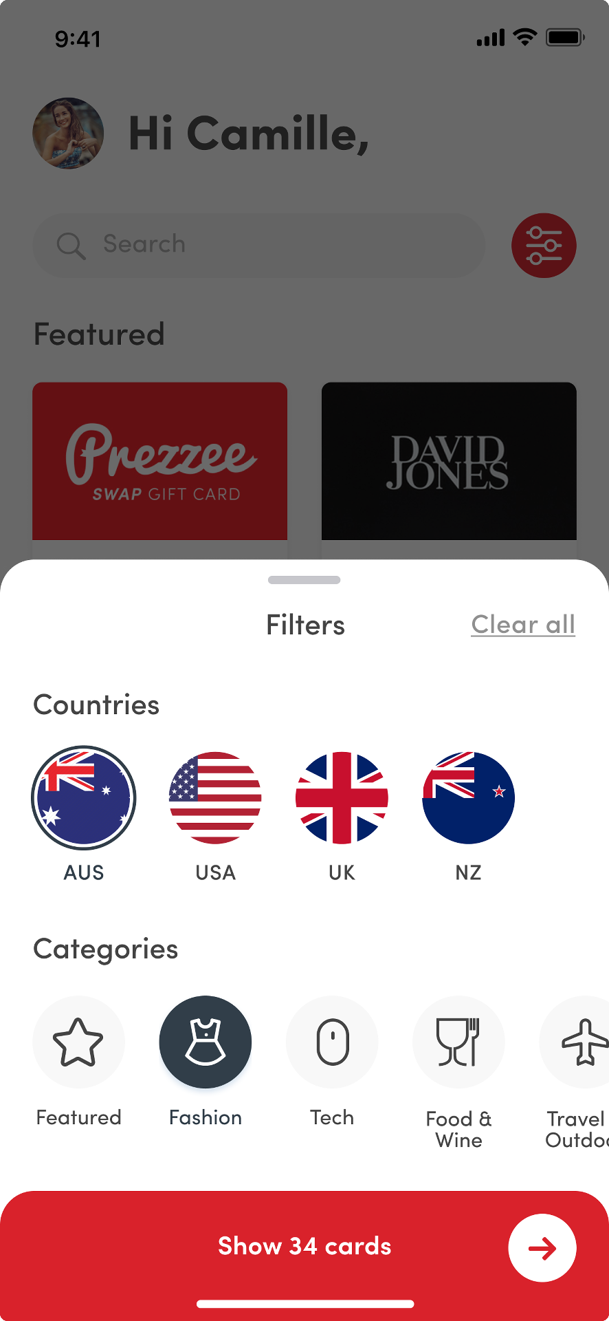
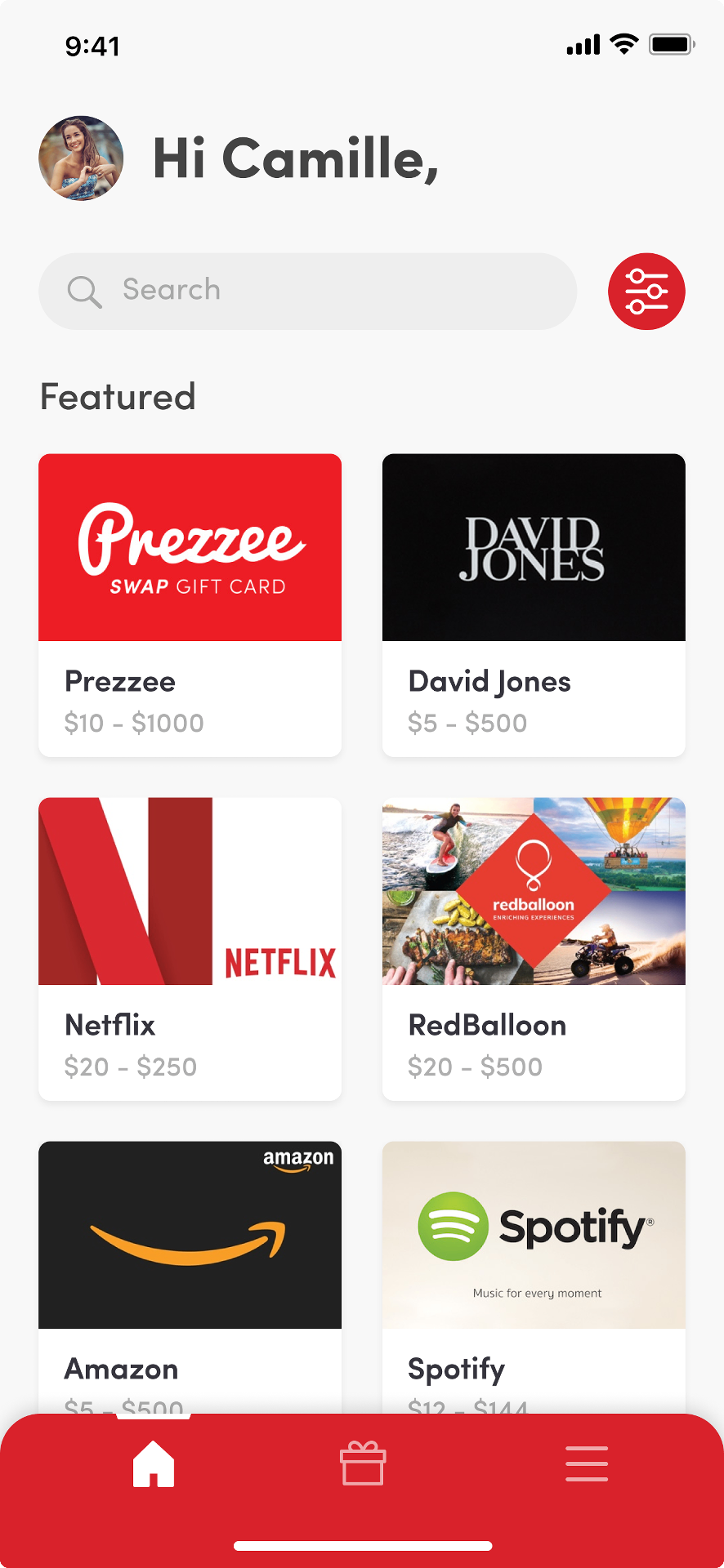
As Prezzee’s catalogue grew, customers needed a faster way to find the right gift card. I introduced a prominent search bar for customers looking for a specific brand, alongside filters that allowed them to browse gift cards by country and category. This supported both direct searches and more open-ended discovery, while making the catalogue easier to navigate across different markets.
SEARCH BY BRAND · FILTERS · STICKY CATEGORIES
The Card Details
Where brand identity meets purchase intent.
The card details screen was the most important point in the purchase journey. It needed to balance two goals: making each gift card brand feel immediately recognisable, while keeping the experience consistent and easy to use. I created a flexible framework where partner colours, imagery and card artwork shaped the top of the screen, while Prezzee’s product structure remained consistent below. This is also where I introduced two purchase options: Buy for yourself, which led directly to checkout, and Buy for a friend, which opened the simplified gifting flow.
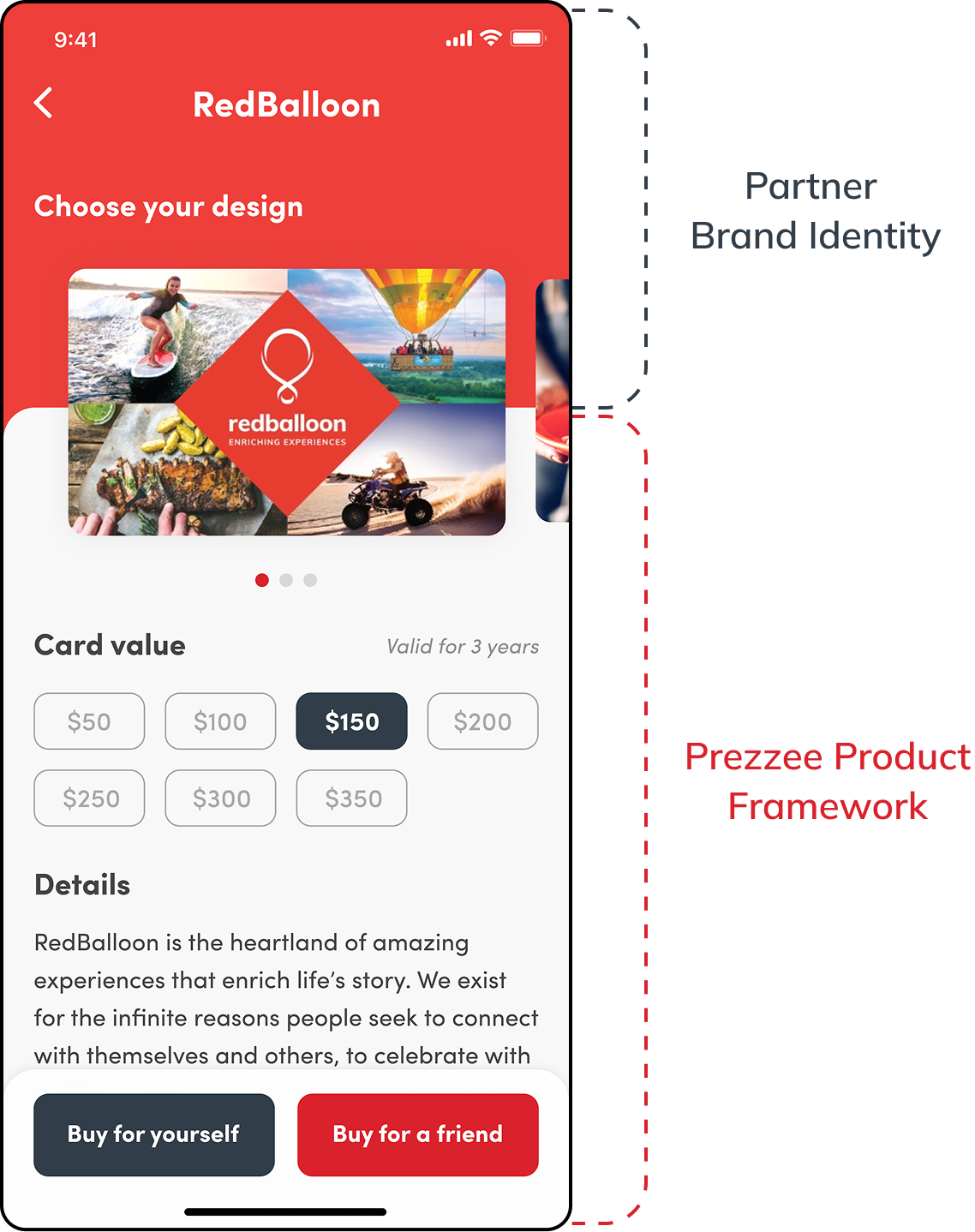
ACROSS MULTIPLE PARTNER BRANDS
A flexible card details framework.
Make a Gift
From five steps to three.
When customers selected Buy for a friend, they entered a focused three-step gifting flow. I removed unnecessary screens and grouped related information together, while keeping the selected gift card and value visible throughout the journey. Each screen focused on one clear decision: choose the greeting card, add the recipient details, then review and pay.
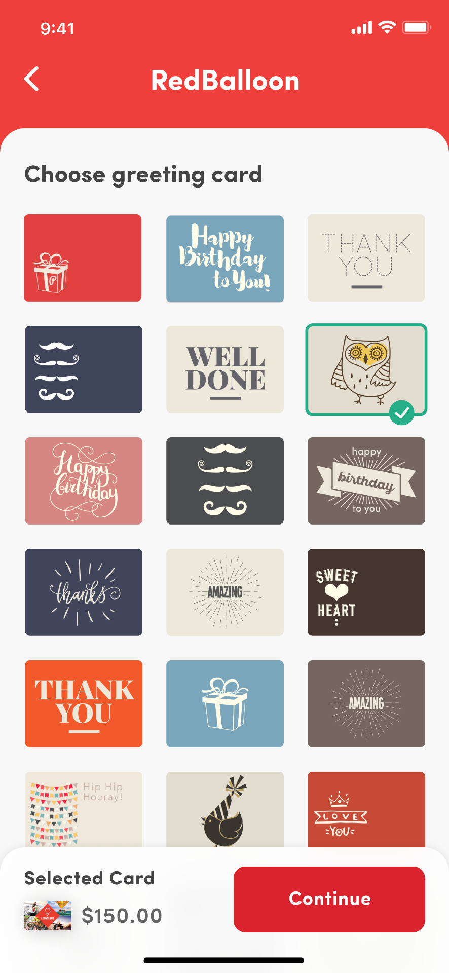
Choose a Greeting Card
Customers selected the design the recipient would see when opening their gift.
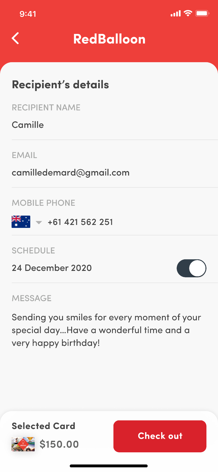
Add Recipient Details
Recipient information, a personal message and an optional delivery date were brought together on one screen.
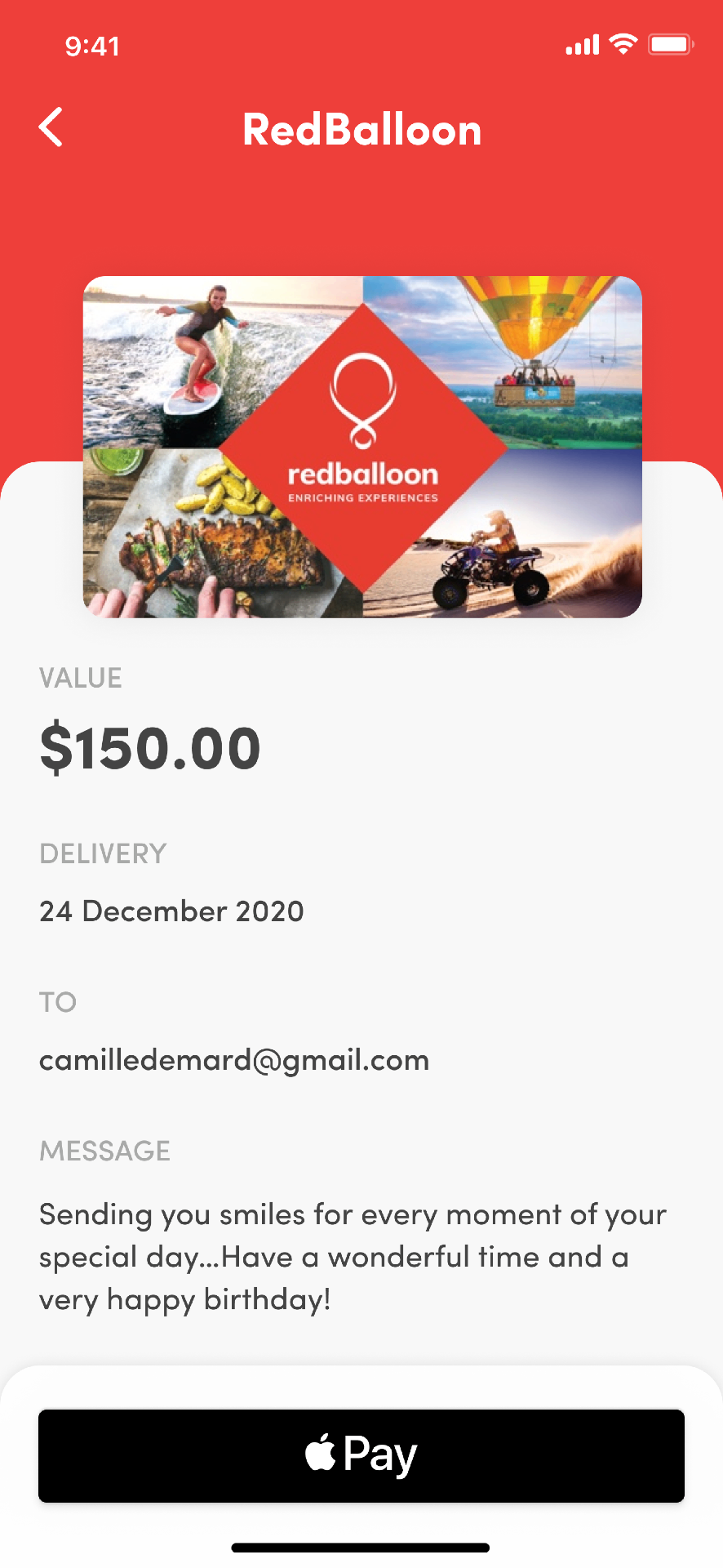
Review & Pay
Customers could review the gift card value, recipient, delivery date and message before completing the purchase.
My Gift Cards
Turning received gift cards into a usable wallet.
Digital gift cards can easily get lost in emails. The wallet brought every card into one place, with balances and redemption details easy to access. Customers could swipe between cards, open one when ready to redeem it, or add it directly to Apple Wallet for faster access.
SWIPE TO BROWSE · TAP TO REDEEM · BALANCE ALWAYS VISIBLE
Outcomes
A simpler purchase experience built to scale
The redesign simplified how customers bought and managed gift cards, reducing friction in the purchase journey while creating a stronger foundation across mobile and web.
PRIMARY UX OUTCOME
5 → 3 STEPS
The gifting journey was reduced from five steps to three by removing unnecessary screens and grouping related decisions together.
4.8★
APP STORE RATING FOLLOWING LAUNCH · 2021
+37%
PURCHASE CONVERSION
−41%
PURCHASE ABANDONMENT
DESIGNED TO SCALE
The redesigned experience launched when Prezzee served more than 100,000 customers and created a scalable product foundation as the business expanded to millions of users across web and mobile.
BEFORE
Every customer was pushed through the same five-step gifting journey, regardless of whether they were buying for themselves or someone else.
AFTER
Customers could choose a path based on purchase intent, with self-purchases moving directly to checkout and gifting reduced to three focused steps.