Case Study — 04/06
Air France — Reimagining the travel experience
A concept exploring how Air France could create a more connected digital travel experience, from finding inspiration and booking a flight to discovering what to do at the destination.
- Role
- Product Designer, UX/UI
- Timeline
- 10 weeks
- Platform
- Web
- Project type
- Independent concept project
PROJECT OVERVIEW
Overview
This independent concept explores how Air France’s digital experience could better reflect the confidence of its brand while making a complex booking journey easier to understand and navigate. I focused on the moments where travellers make the most important decisions, from finding a flight and comparing options to choosing extras, seats and planning the wider trip.
- SCOPE
- Responsive airline website, flight search, booking journey, passenger details, seat selection and checkout.
- RESPONSIBILITIES
- UX research, information architecture, user flows, interface design and interactive prototyping.
- TEAM
- Independent concept.
Challenges & Solutions
Air France’s brand communicates confidence and elegance. The digital experience didn’t always carry that same clarity through the booking journey.
I looked at the wider travel experience, from choosing a destination to booking a flight and planning the stay, and focused on three moments where the journey could feel more connected.
01 / 03
Different reasons to visit
Some travellers arrive ready to book, while others are still exploring or planning their trip.
Keep booking front and centre, while making inspiration and travel planning easy to discover.
02 / 03
Information overload
Fares, baggage, seats and upgrades could make it harder to see how each choice affected the itinerary and total cost.
Flights, fares and conditions were organised to make differences clearer at a glance.
03 / 03
A fragmented travel journey
Booking a flight and planning what happens at the destination can feel like separate experiences.
Bring booking, destination discovery and trip planning into one connected experience.
Traveller mindsets
Three travellers. Different priorities. One journey.
Rather than designing around an average traveller, I used three scenarios to explore how different priorities could shape the experience, from inspiration and flexibility to speed, transparency and planning as a family.
CLICK A CARD FOR THE FULL PERSONA
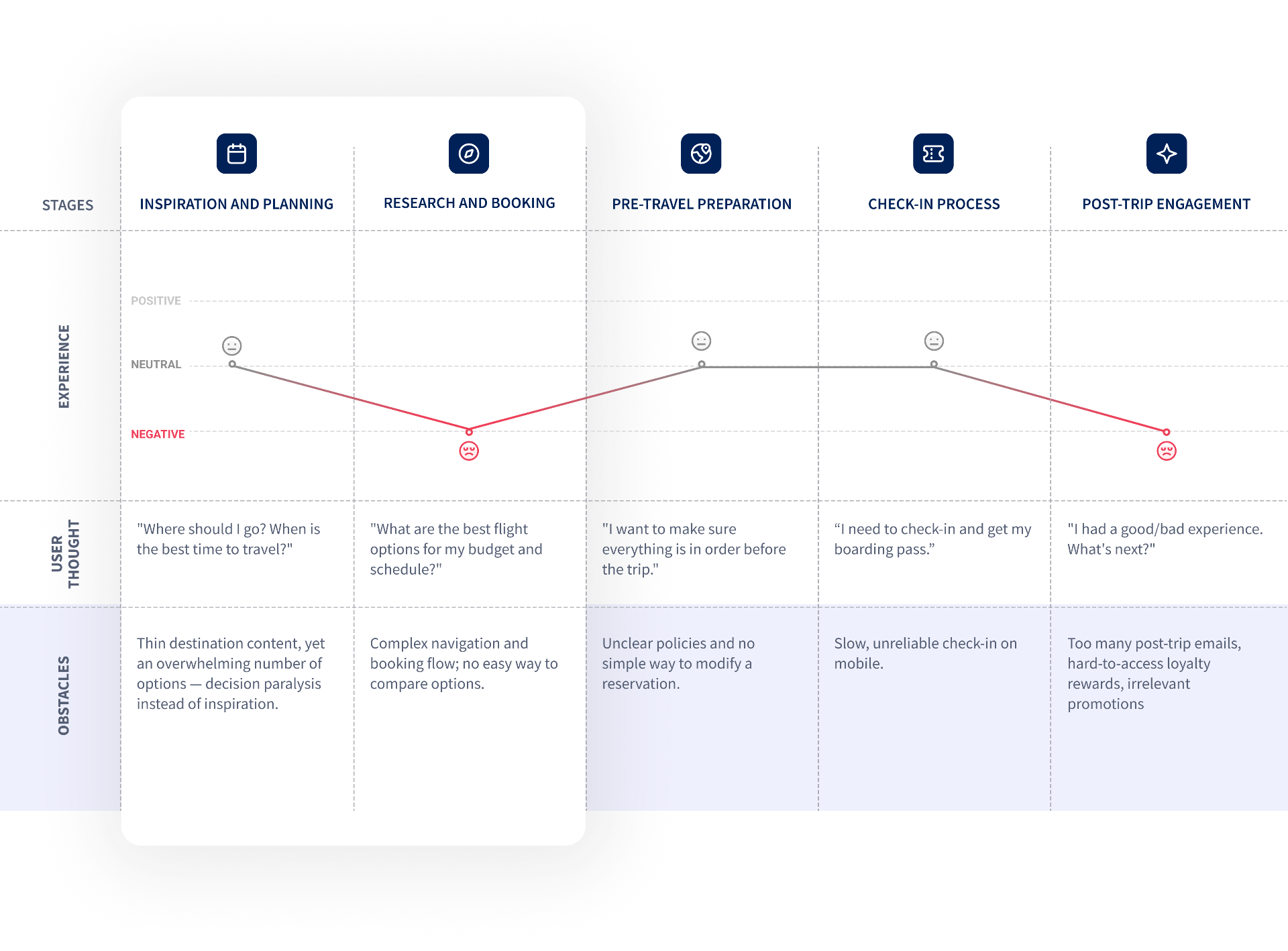
Understanding the Travel Journey
Looking beyond the booking flow.
I mapped the journey from inspiration to arrival to see where things became harder than they needed to be. The biggest opportunities were around choosing, booking and planning the trip.
Visual Language
Colors
Air France already had a distinctive visual identity. Rather than reinventing it, I simplified how it was applied to the digital product. A deeper blue created stronger hierarchy and contrast, while red was used more selectively for primary actions and important states. More space, clearer typography and quieter supporting colours helped the functional parts of the experience feel closer to the confidence of the brand.
Typography
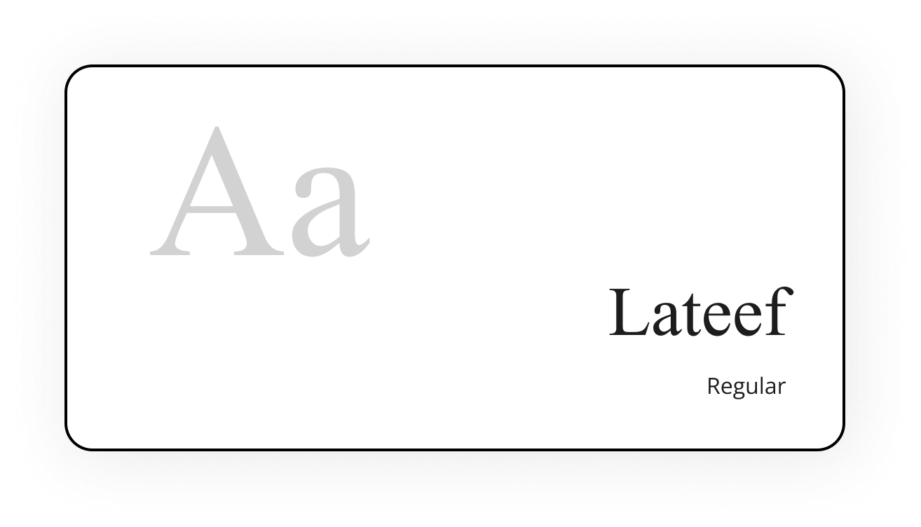
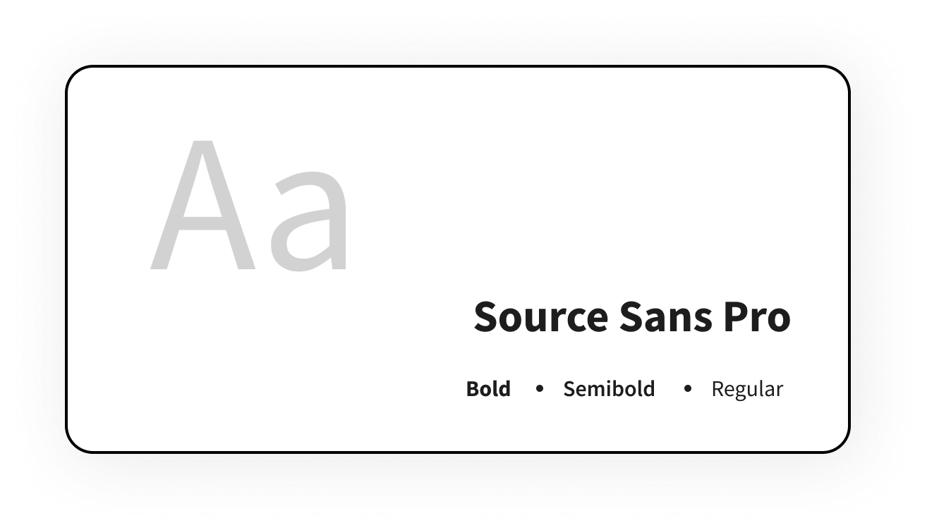
I chose to work with two typefaces. Lateef’s elegant, calligraphic style reflects Air France’s refined brand identity and brings a sense of sophistication to the experience. Source Sans Pro was selected for its clarity and legibility, making information easy to read and the interface feel reliable.
Booking, End to End
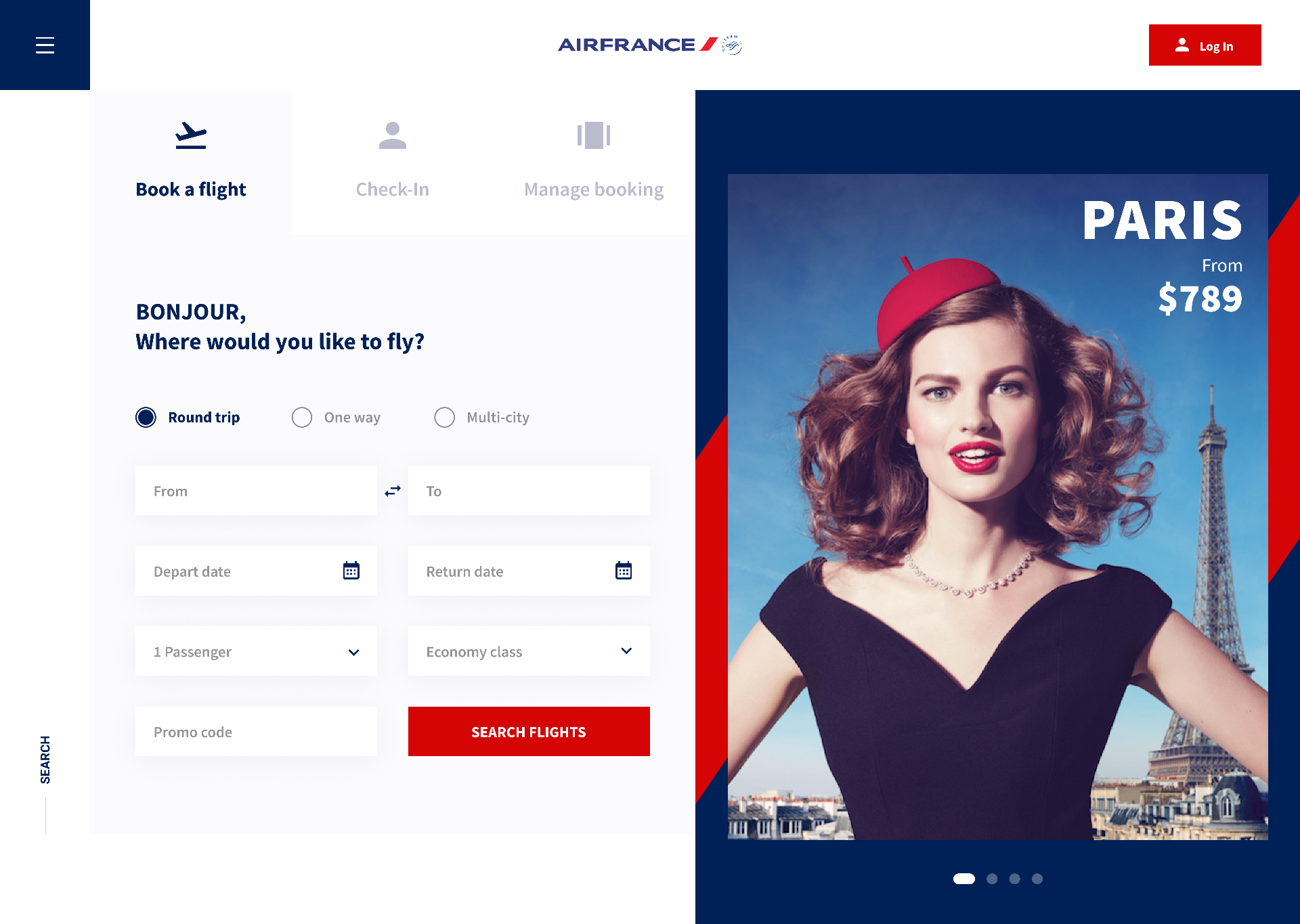
Bonjour. Where would you like to fly?
Booking remains the main action, but it’s not the only reason travellers visit. I designed the homepage to make it easy to book a flight while also surfacing the services, destinations and inspiration that can shape the rest of the trip.
01 — THE HOMEPAGE
The homepage keeps booking at its core while opening the experience to more of the journey around it.
Book a flight
Start with the main task
Flight search stays at the top of the experience, giving travellers who already know where they want to go a clear and immediate starting point.
Travel assistance
Go beyond the flight
Hotels, activities, transfers and other travel services are brought into the same experience, making it easier to plan more of the trip in one place.
Best deals
Make destination discovery easier
Featured fares give travellers another way into the journey, especially when the destination is still flexible.
Travel guides
Turn inspiration into planning
Destination guides bring together places and ideas to explore, helping travellers move from choosing where to go to imagining what the trip could look like.
FLIGHT RESULTS
Make flights easier to compare.
Flight times, duration, connections and fares are structured around comparison, helping travellers understand the differences between options without opening each one individually.
02 — SEARCH
KEEPING THE TRIP IN SIGHT
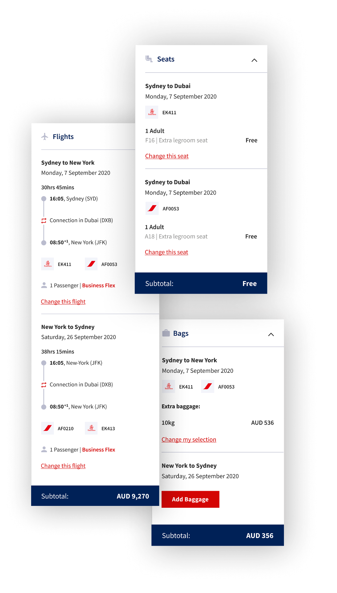
Context that follows the traveller.
As the booking progresses, the trip remains visible. Dates, route, passengers and previous selections provide a consistent point of reference, reducing the need to remember information from earlier steps.
OPTIONS & UPGRADES
Make the impact of every choice clear.
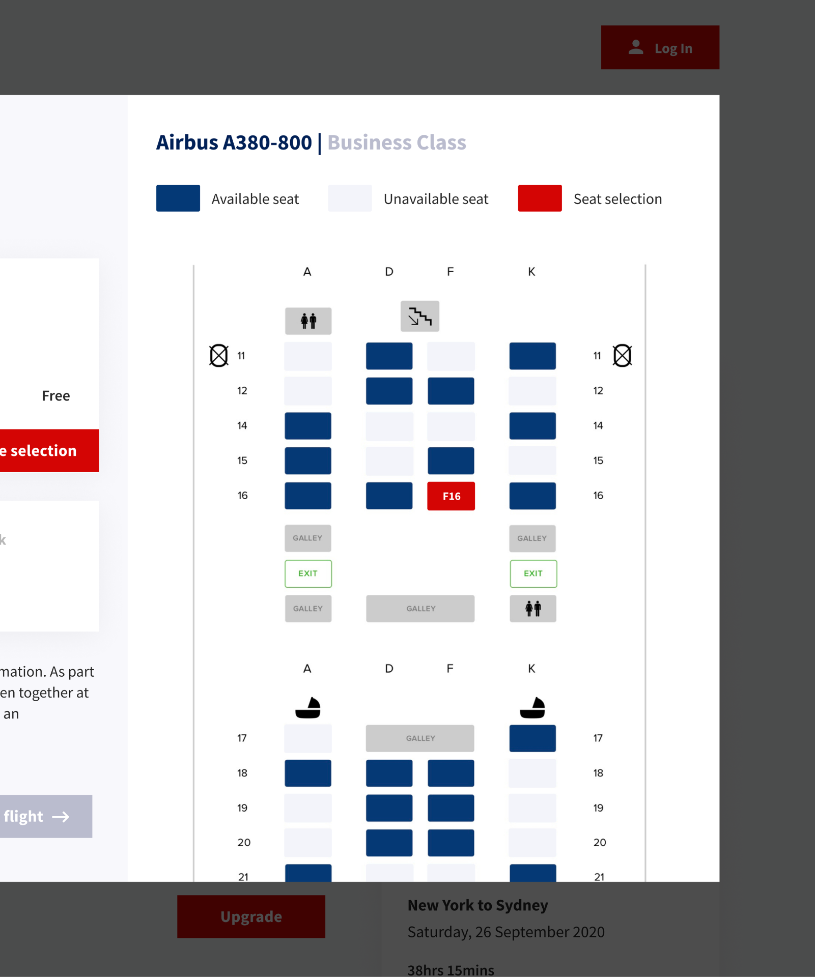
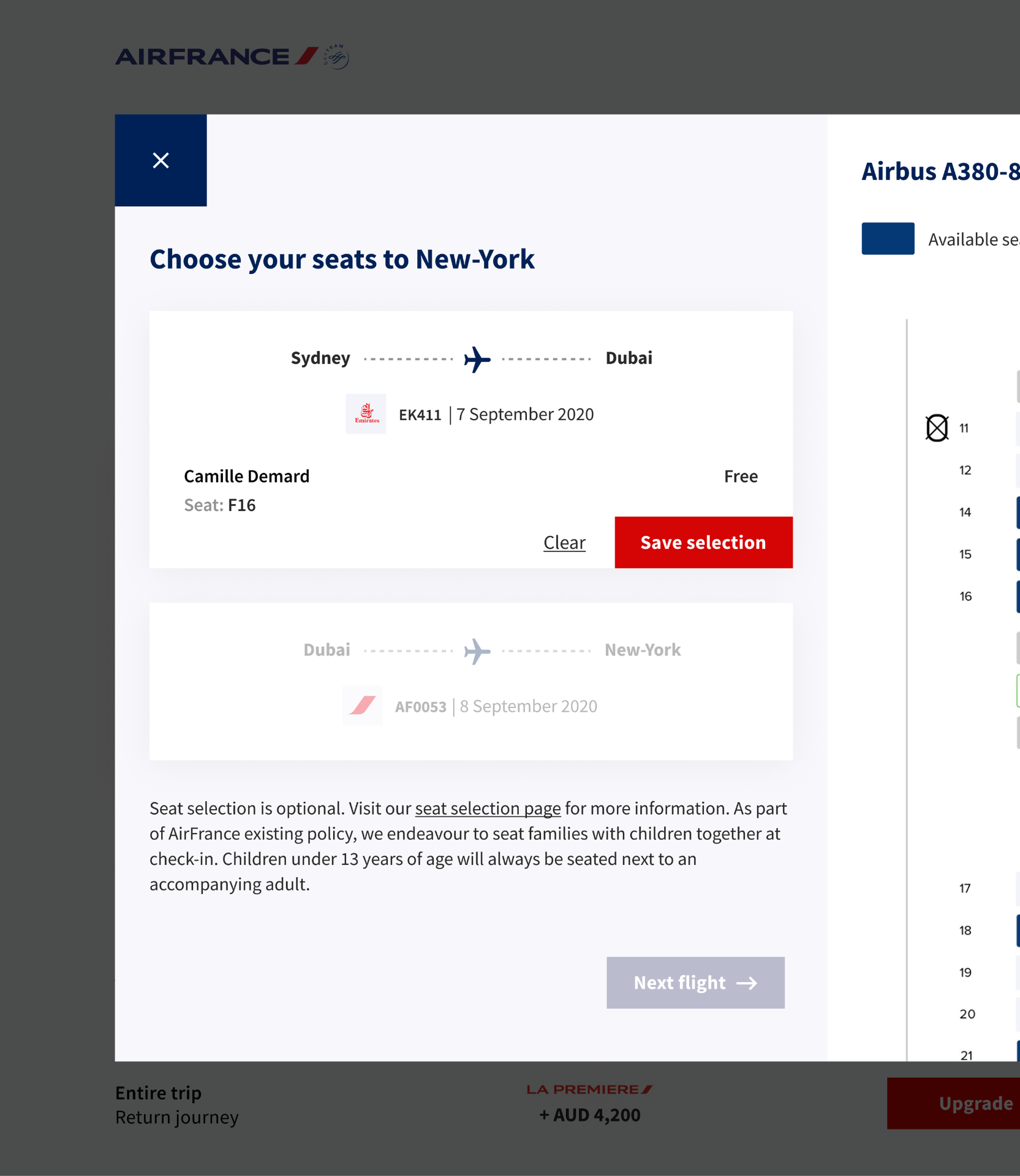
Seats, baggage and upgrades are presented alongside what is included and how each choice affects the total price. Travellers can make additional decisions without losing sight of what the trip is becoming or what it will cost.
03 — OPTIONS & UPGRADES
Inspiration, Not Just Booking
The journey can start with a destination, not just a flight search.
Destination content gives travellers another way into the experience, helping them explore where they might want to go before they are ready to book.
Destination content becomes more than inspiration. It creates a path from discovery to planning, with booking always within reach.
01 — TRAVEL GUIDE
EXPLORE A CITY
Turn destination interest into a next step.
Travellers can explore the city, discover places and activities, and build a clearer picture of the trip before committing.
A direct booking CTA keeps the journey connected, allowing inspiration to move naturally into flight search when the traveller is ready.
02 — EXPLORE A CITY
EXPLORE ACTIVITIES
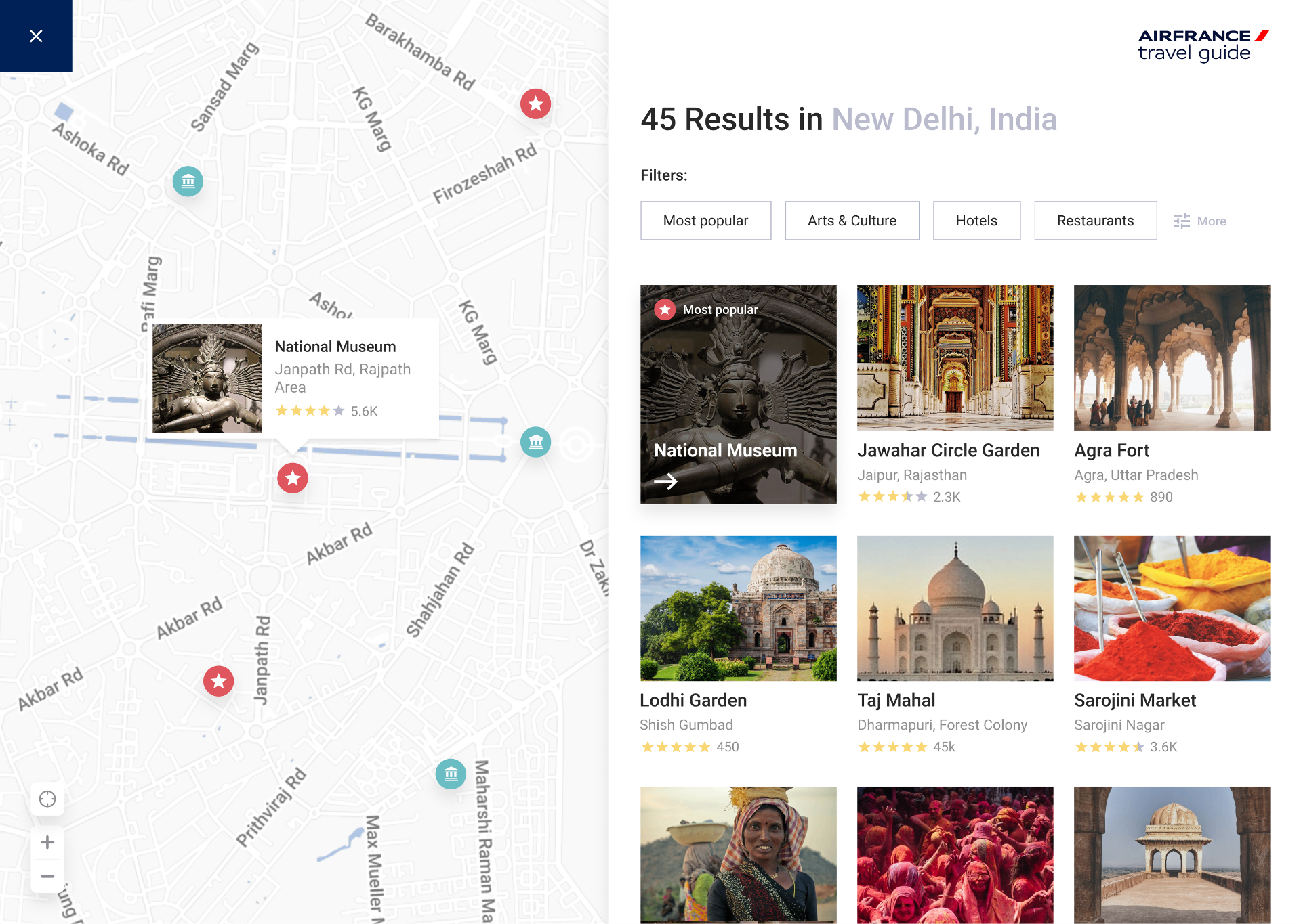
Move from discovery to planning.
Activities can be explored by interest or directly on the map, helping travellers understand what is nearby and start shaping their stay around the experiences that matter to them.
03 — EXPLORE ACTIVITIES
Best Deals
For travellers who are still flexible about where to go, the deals page offers another way into the journey. Destinations are grouped by region and paired with clear fares, making it easy to compare possibilities before choosing a trip. Each offer creates a direct path into booking, turning price-led discovery into an actionable next step.
01 — BEST DEALS
CHECK-IN
Keep the journey moving.
Once the flight is booked, the experience shifts from planning to travelling. Check-in remains directly accessible from the homepage, allowing travellers to continue their journey without having to retrace the booking flow.
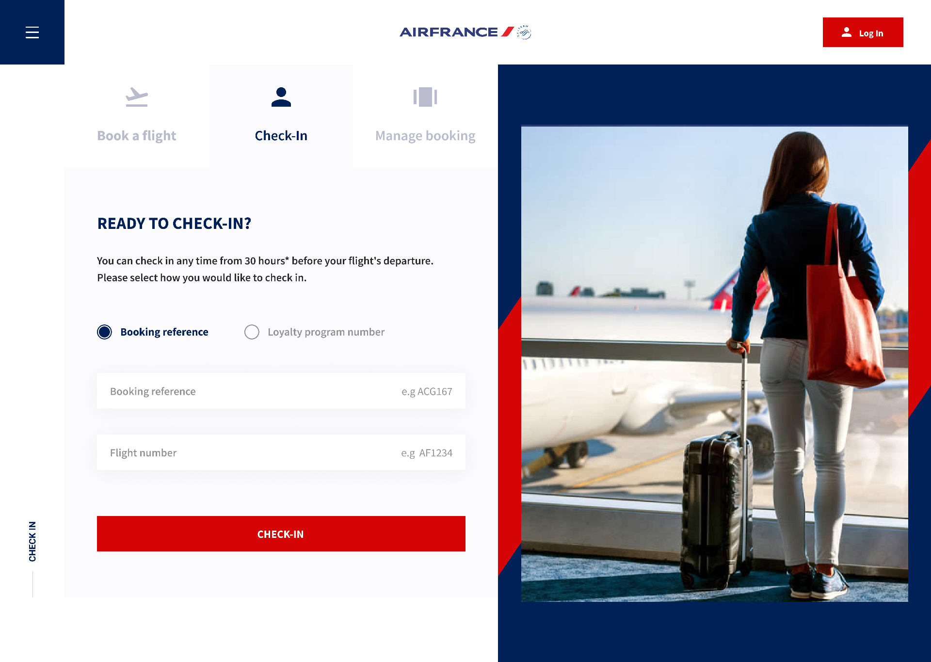
02 — CHECK-IN
A clearer digital expression of the Air France experience
This concept explored how Air France’s premium brand could translate into a more connected and intuitive booking experience.
Important information competed for attention, and the booking journey could feel fragmented across different stages.
A more focused system keeps the trip, price and next decision visible, creating an experience that feels more aligned with the Air France brand.