Case Study — 01/06
Karta — B2B Gift Card Platform
Designing a self-service ordering portal for companies and the internal tool that powers it — two products, one system, built from zero.
- Role
- Senior Product Designer
- Timeline
- 1 year
- Platform
- Web — B2B & Internal
- STATUS
- Live
PROJECT OVERVIEW
Overview
Karta’s corporate gift card service relied on phone calls, emails, spreadsheets and one-off design requests. I designed two connected products from the ground up: an Ordering Portal where companies could place and manage bulk orders, and Karta Connect, an Internal Platform used by Sales and Operations. Together, they brought the full workflow into one system, from campaign setup to fulfilment.
- SCOPE
- B2B ordering, campaign management, card customisation, customer self-service and internal operations.
- RESPONSIBILITIES
- Product strategy, UX and UI design, prototyping, system design, engineering handover and design QA.
- TEAM
- Product Manager, Sales stakeholders and Engineers.
Challenges & Solutions
The service worked, but every step relied on manual coordination between companies, Sales and Operations. I focused on three areas where the process was creating the most friction: placing an order, customising a card within Mastercard requirements, and keeping everyone aligned once the campaign was underway.
01 / 03
Every order started with a phone call.
Companies couldn't place bulk gift card orders on their own. Every order required calls, emails, and manual coordination with the Sales team before processing could even begin.
Self-service ordering portal
Companies can independently create bulk orders, select gift card values, upload recipient lists, and submit orders in minutes eliminating unnecessary back-and-forth.
02 / 03
Designing within Mastercard constraints.
Businesses brand their own gift cards — but every design must be reviewed and approved by Mastercard before it can be issued. Full freedom over logo placement meant non-compliant designs, repeated approval rounds and production delays.
Predefined branding zones
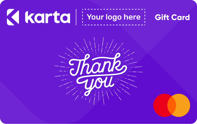
I created predefined branding zones, designed around the card's fixed elements and Mastercard's requirements: businesses choose an approved layout, upload their logo and preview the final card — flexible enough to express a brand, controlled enough to pass approval first time.
03 / 03
Orders disappeared into emails and spreadsheets.
Without a central system, the Sales team tracked orders across emails and spreadsheets. There was no clear view of each order's status, making collaboration, follow-ups, and fulfilment difficult to manage.
Internal order management platform
A dedicated workspace where the Sales team can review, approve, decline, and track every order from submission to fulfilment, all in one place with a shared order queue and clear statuses.
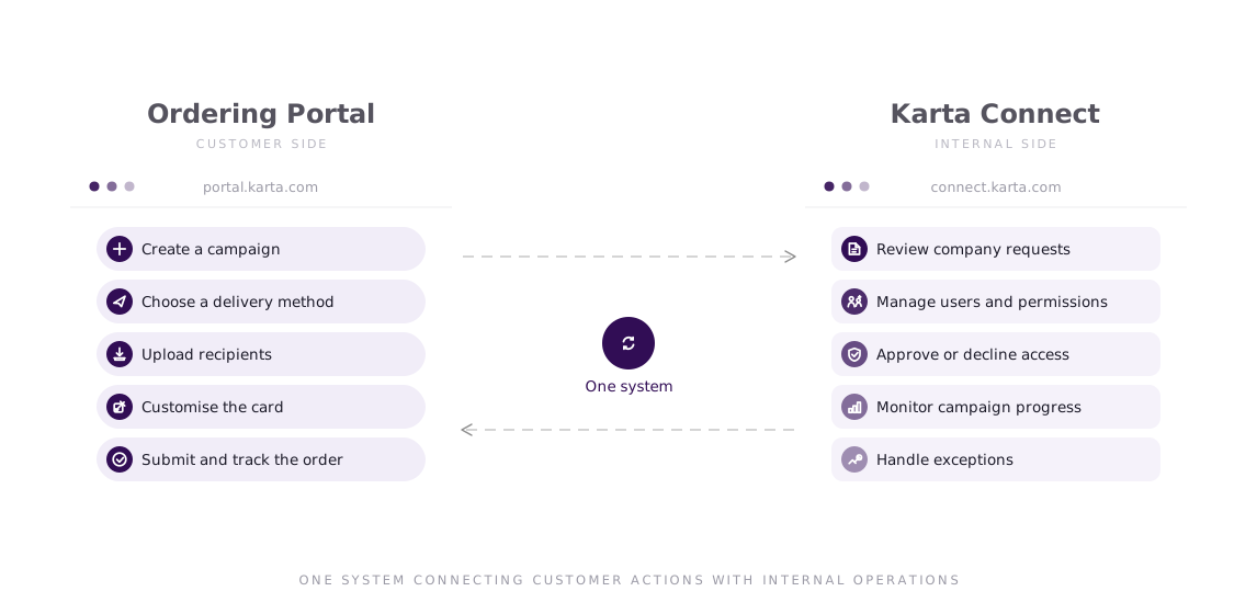
One System, Two Faces
Companies placed bulk gift card orders through the Ordering Portal, while the Sales team managed those same orders internally. By designing both platforms together, I created a single workflow shared across two products.
Process
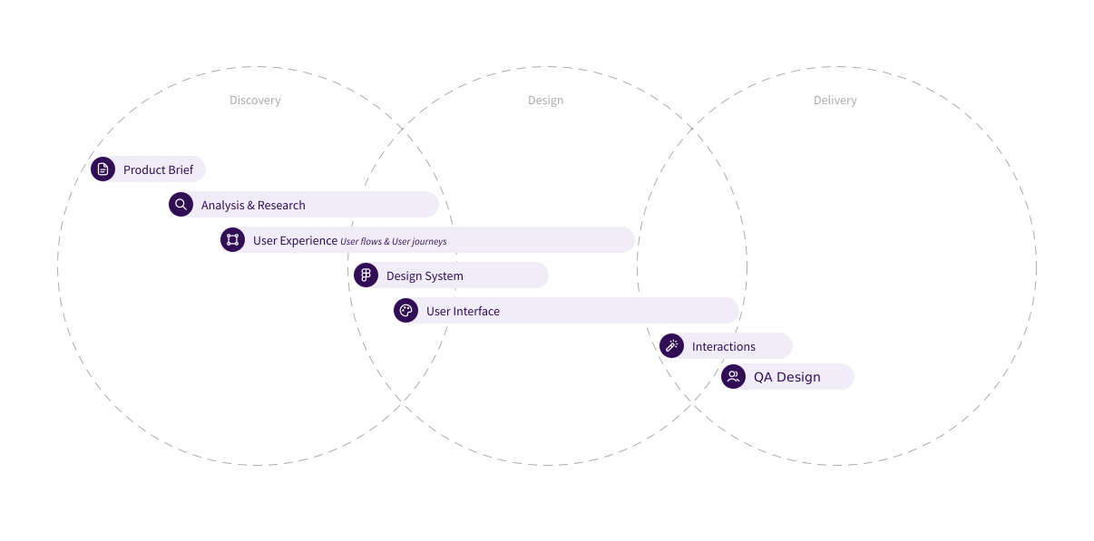
I worked closely with Product, Sales and Engineering throughout the project. Because the internal users were part of the Karta team, I could observe their workflows, test ideas quickly and refine the product through weekly feedback. Each sprint ended with engineering handover, Design QA and Jira follow-ups
Visual Language
One design language across both products — calm on the customer side, dense on the internal side, same foundations underneath.
Purple carried the Karta brand across both products, while dark navy supported dense content and strong hierarchy. Green, coral and lighter tints helped communicate statuses, feedback and changes without overwhelming the interface. WCAG 2.1 contrast ratios were considered throughout the system to keep content clear and legible.
Gilroy brought a bold, modern character to headings and key actions. Rubik was used for body copy and interface content, offering the readability needed across forms, tables, statuses and longer workflows. Together, they created a clear hierarchy that could adapt to both the guided portal and the denser internal platform.
The Ordering Portal
Companies could choose how recipients would receive their gift cards: through a Karta co-branded email or as activation links distributed through the company’s own channels. Both options followed the same campaign and recipient structure, then adapted the experience around the chosen delivery method. Self-service covered routine campaigns, while access to Sales remained available for larger or more complex requests.
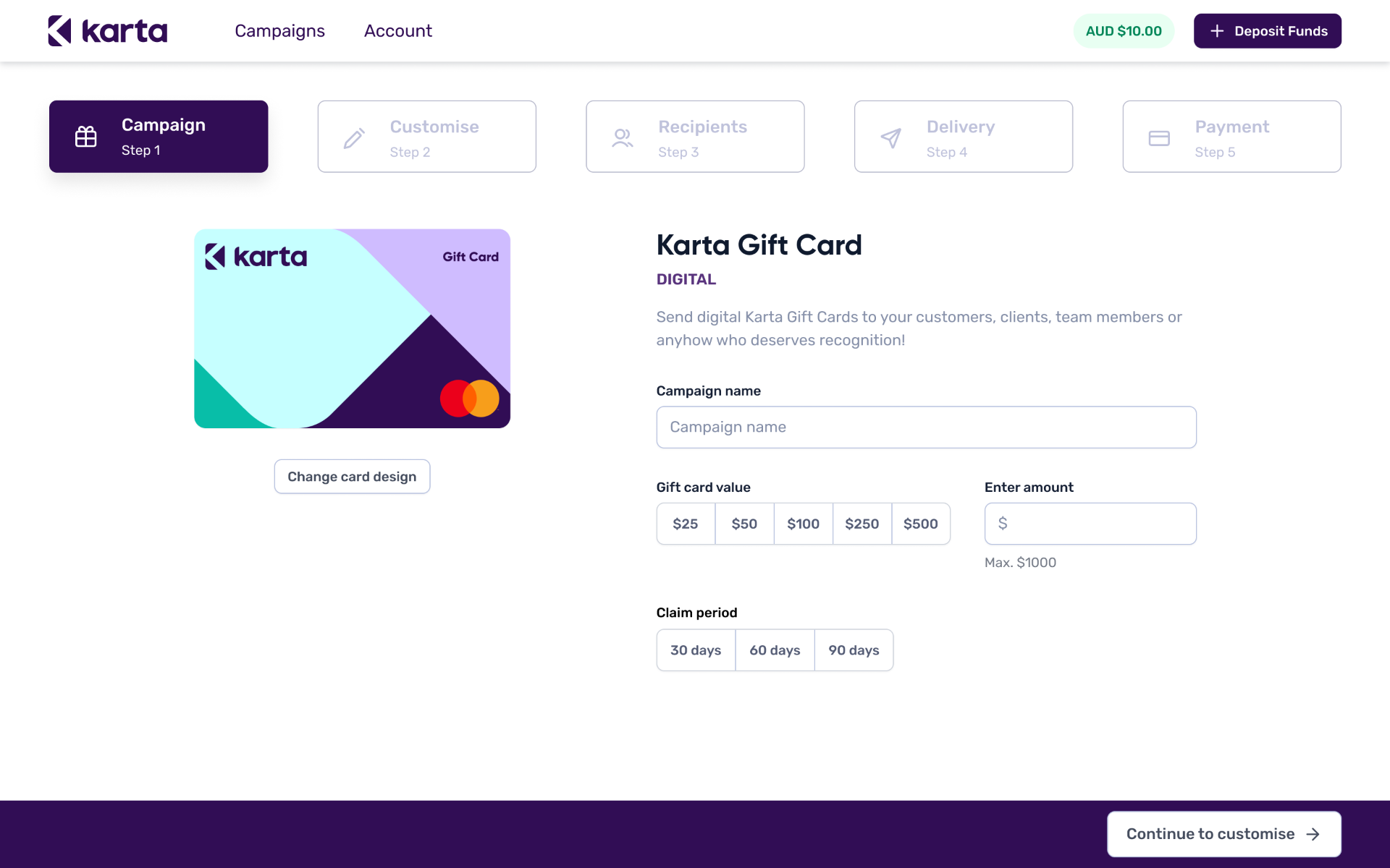
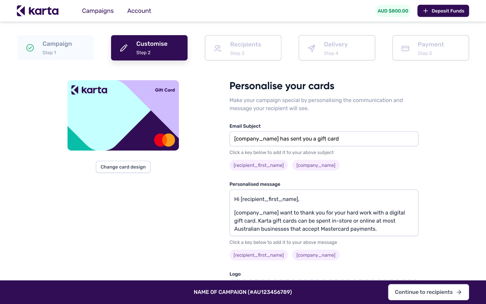
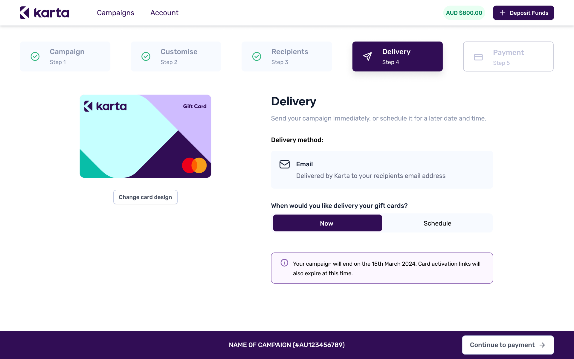
Rather than asking companies to wait for a new Mastercard review, Karta offered a catalogue of pre-approved gift card designs. I designed a five-step self-service flow where companies could manage the campaign from start to finish, including setup, message, recipients, delivery and payment, while the product handled template, balance and compliance rules in the background.
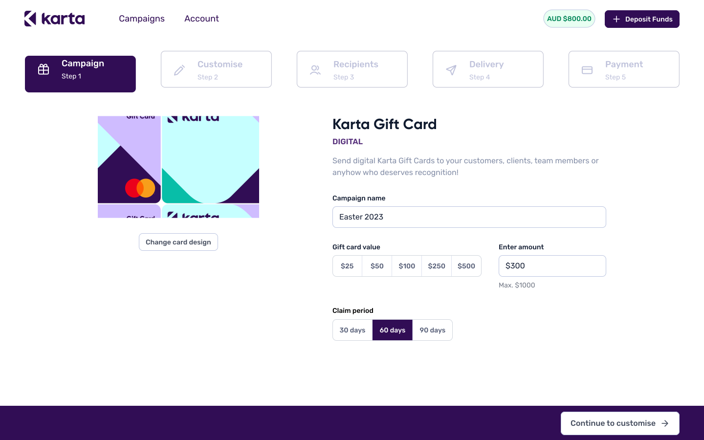
Set up the campaign
Name, value and claim period, captured in one form.
Personalise the communication
The branded email renders live as the message is written.
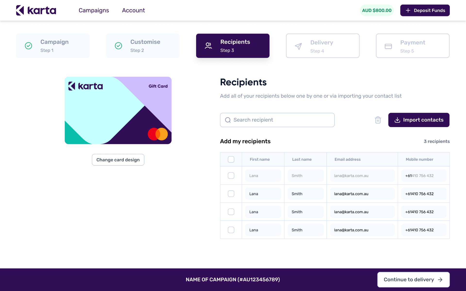
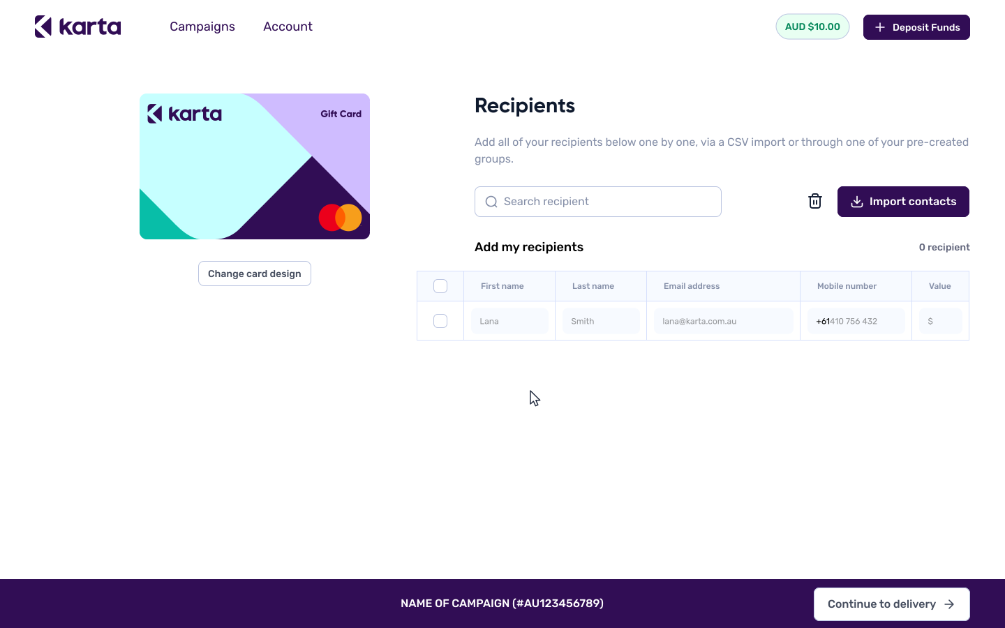
Add recipients
Entered one at a time, or uploaded via CSV for larger sends.
Choose delivery
Send immediately or schedule for a later date, with the claim window surfaced up front.
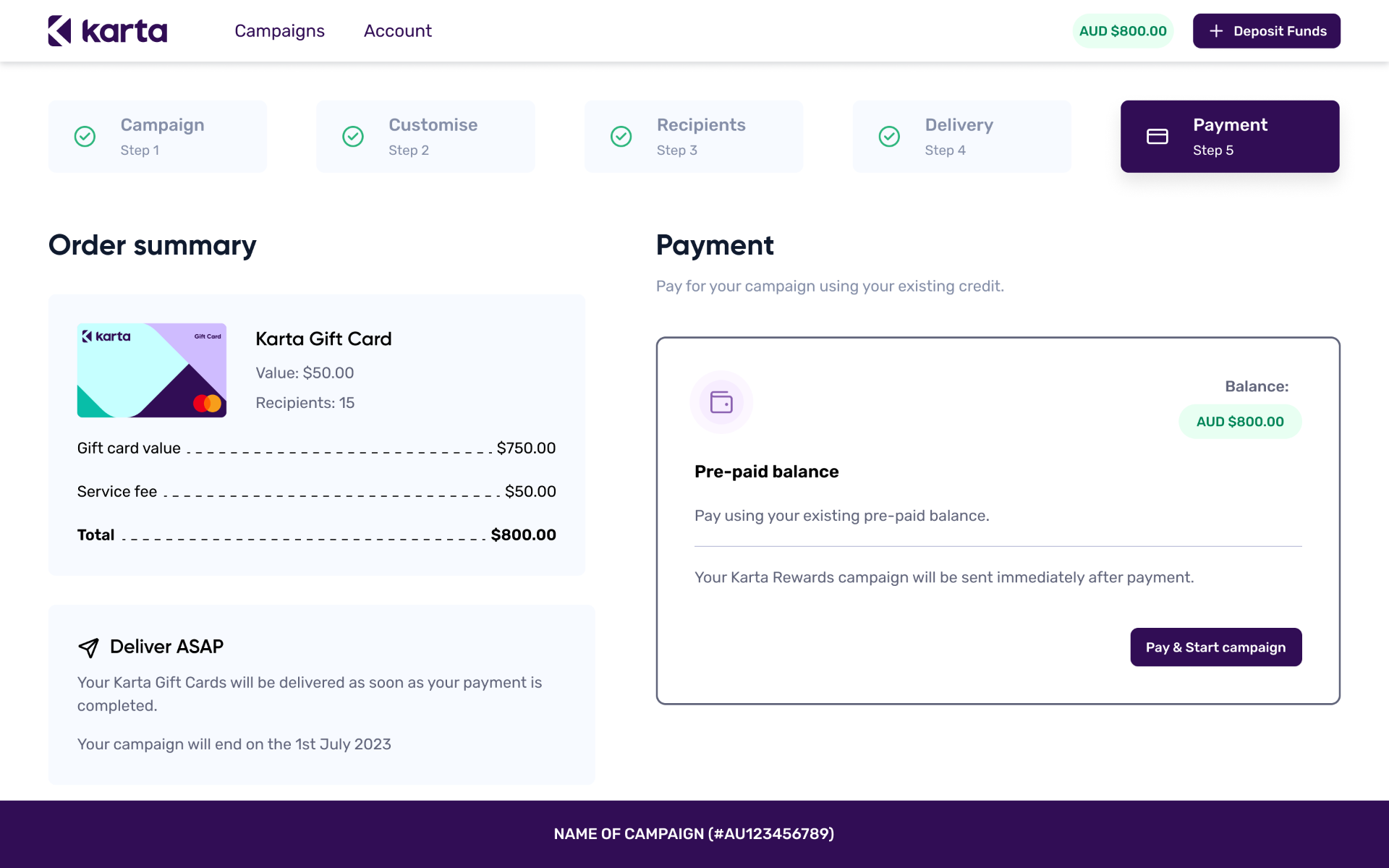
Pay from pre-paid balance
One order summary, one confirmation funded from the company's existing Karta balance.
Two delivery methods, one product — a branded email for companies who wanted Karta to handle the send, and raw activation links for those who wanted to control it themselves.
Some companies already ran their own newsletters, HR tools or internal comms and did not want a second sender in the middle. Rather than force them through the co-brand email, I designed a parallel path that returned raw activation links they could drop into any channel they already trusted.
A CSV of activation links, ready to distribute
Recipients in, links out — one per person, exported and handed back to the company's own systems.
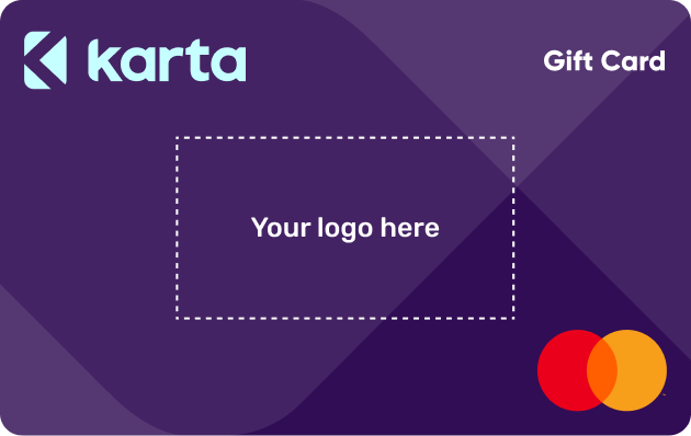
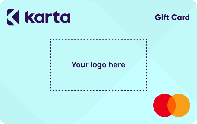
Instead of leaving customers to guess where their branding could sit, I translated the card requirements into visible safe zones and predefined templates.
Companies could upload a logo and preview the card themselves, while the product protected the Mastercard mark, Karta branding and card edges.

Every customised card had to be approved by Mastercard before going live. I translated Mastercard’s compliance requirements and Karta’s brand rules into clear safe zones, showing non-designers exactly where their logo could be placed while reducing the risk of rejection or delays.
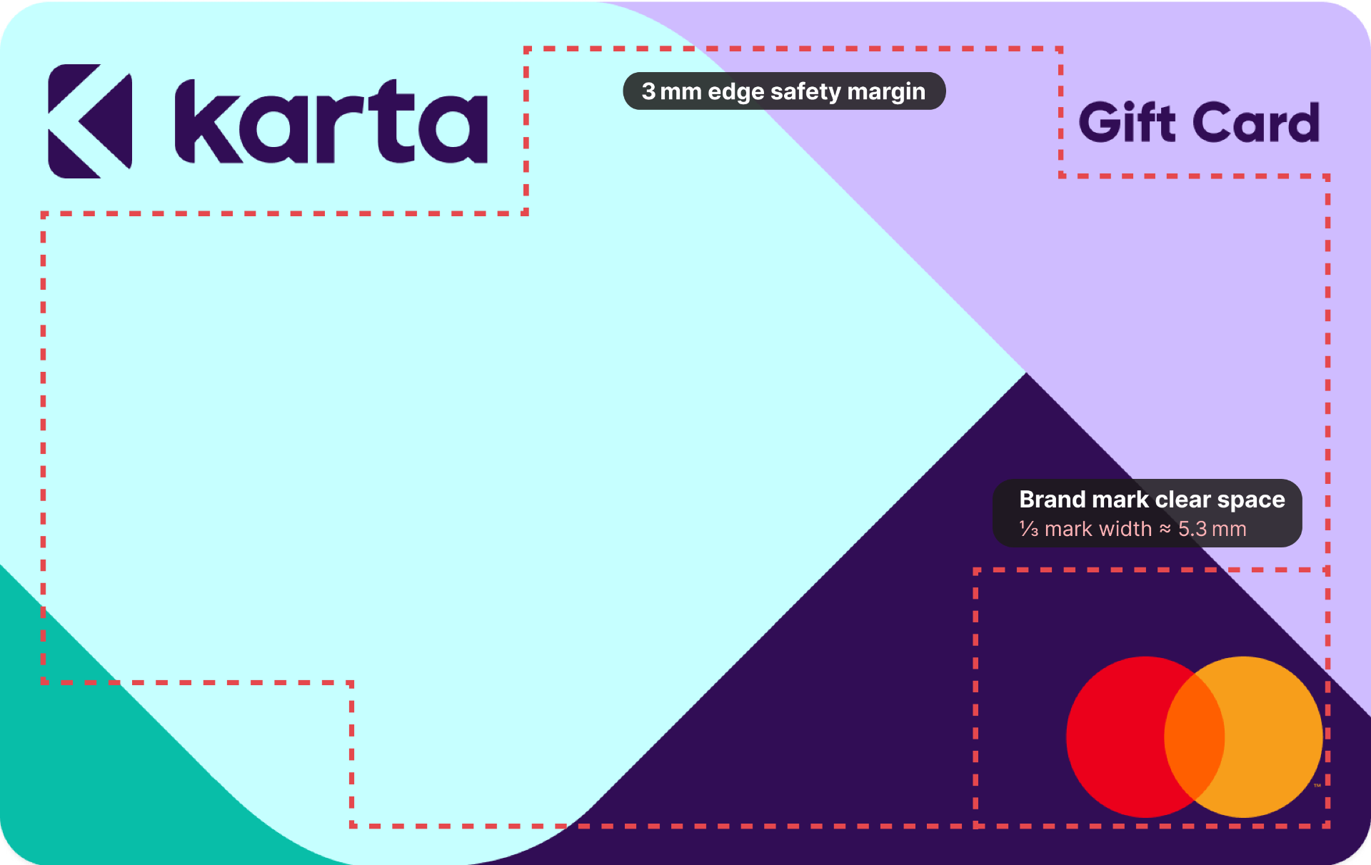
Mandatory clear space around the Mastercard mark, equal to one third of its width.
Protected areas around the Karta logo and Gift Card label.
A 3 mm safety margin kept logos and artwork away from the card edge.







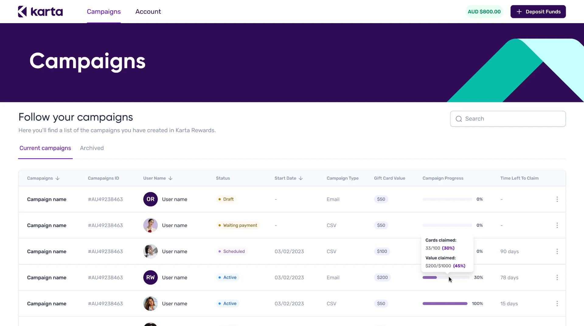
Self-service continued after checkout. Companies could follow campaign status, remaining balance and recipient activity from one dashboard. They could also open an individual campaign to manage recipients, correct details or resend unclaimed gift cards without starting another request with Sales.
The Internal Platform
The order management tool didn't live alone — it plugged into a much larger admin ecosystem I also designed: card issuing, operations, system administration, partner tooling. One command UI, five domains.
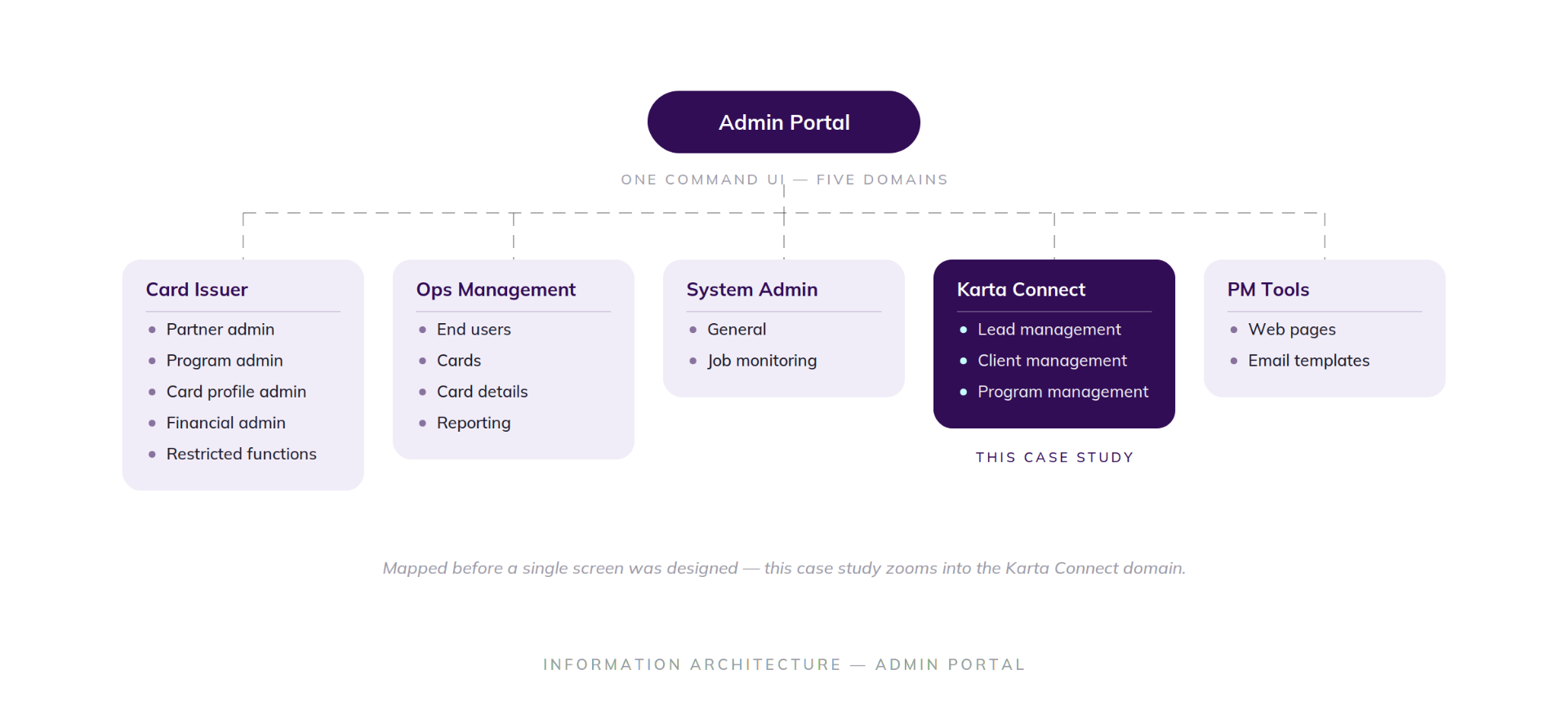
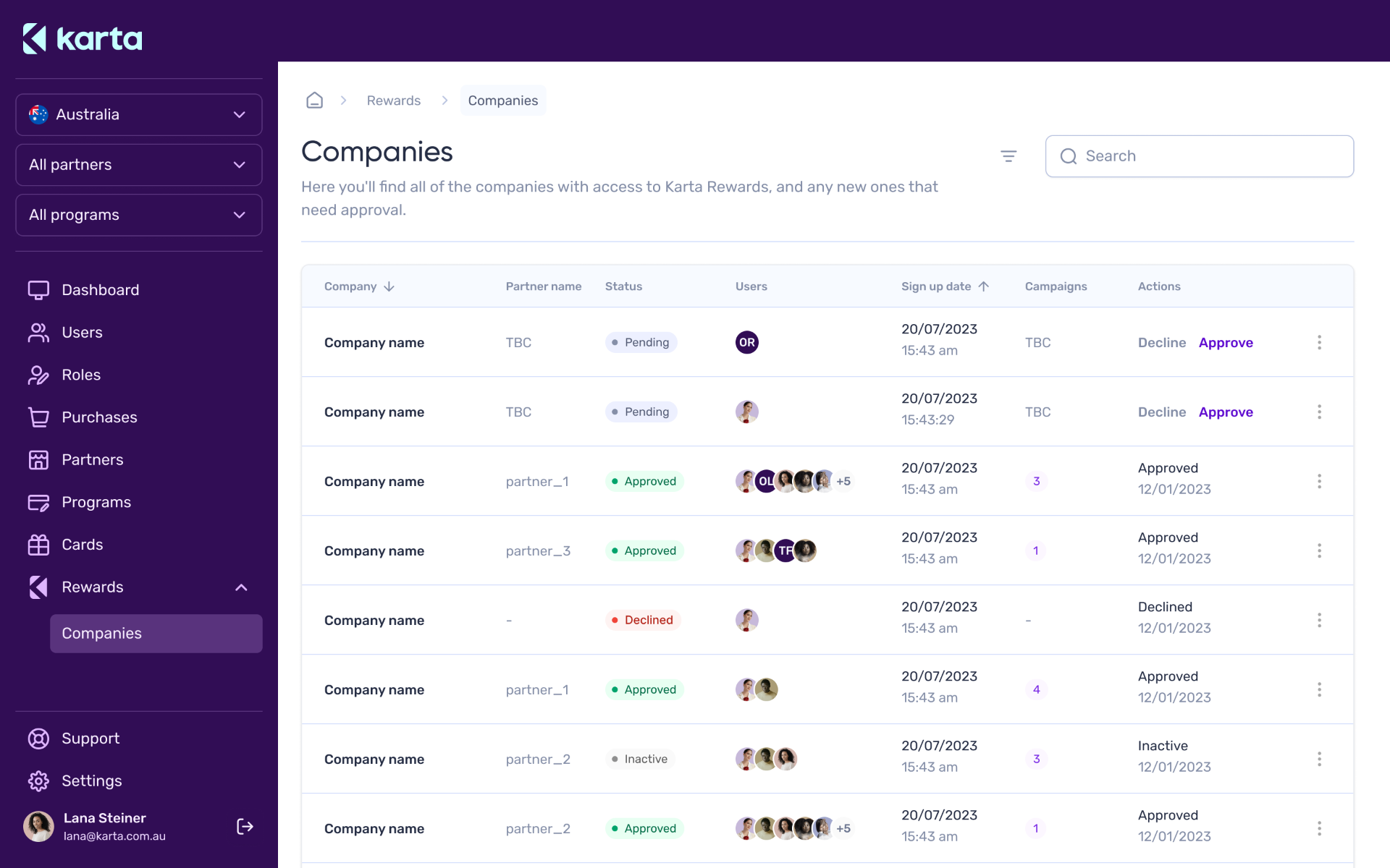
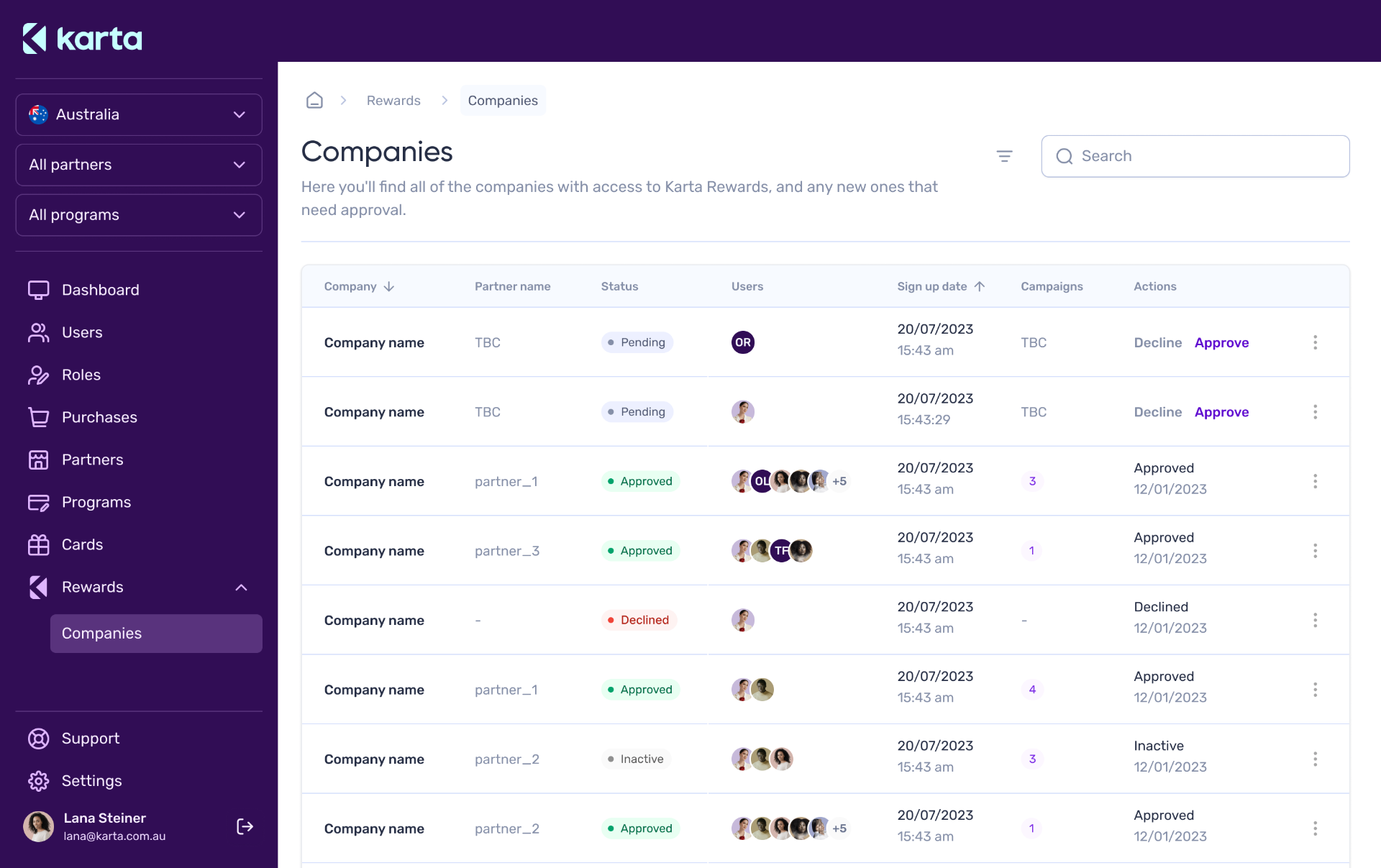
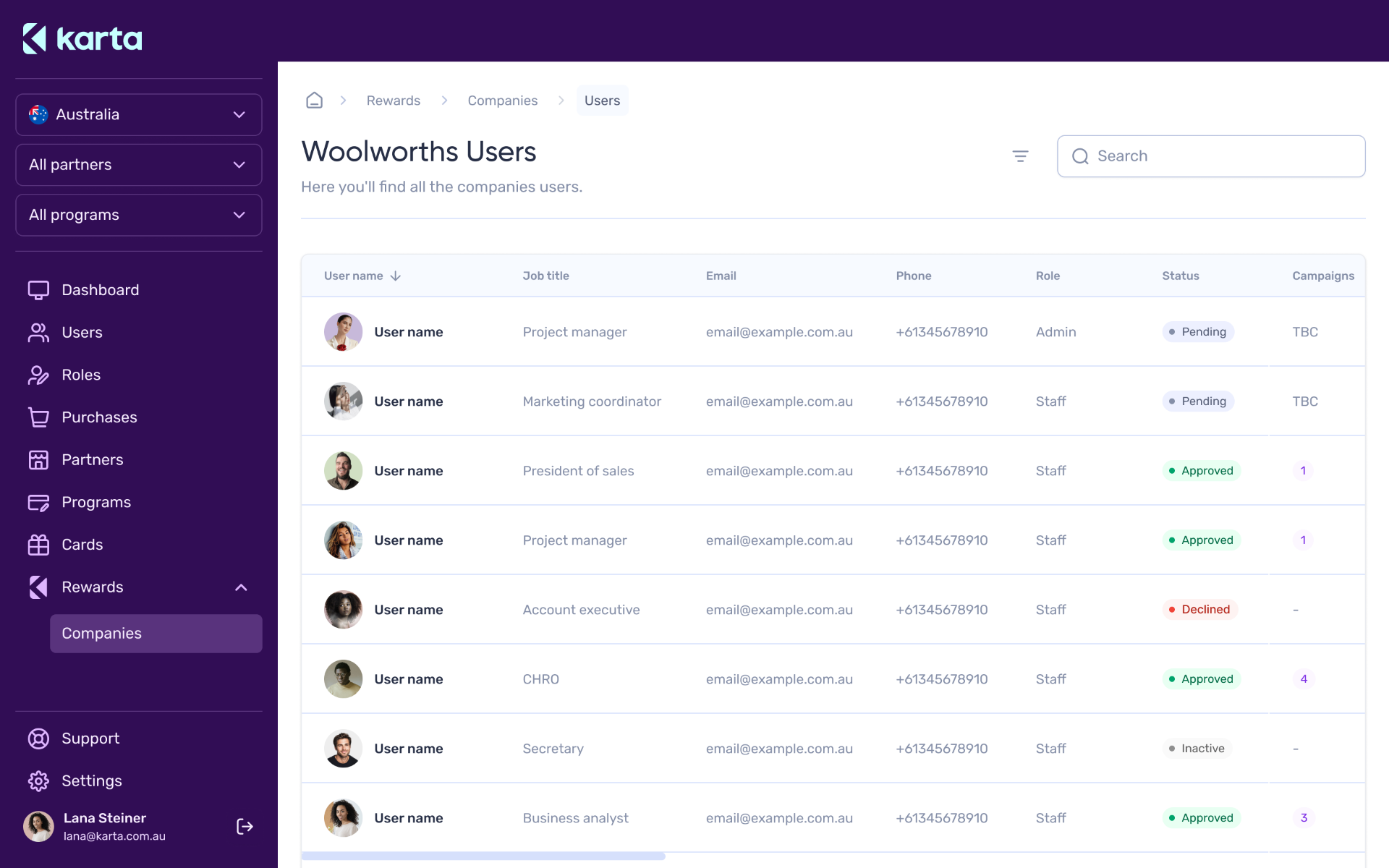
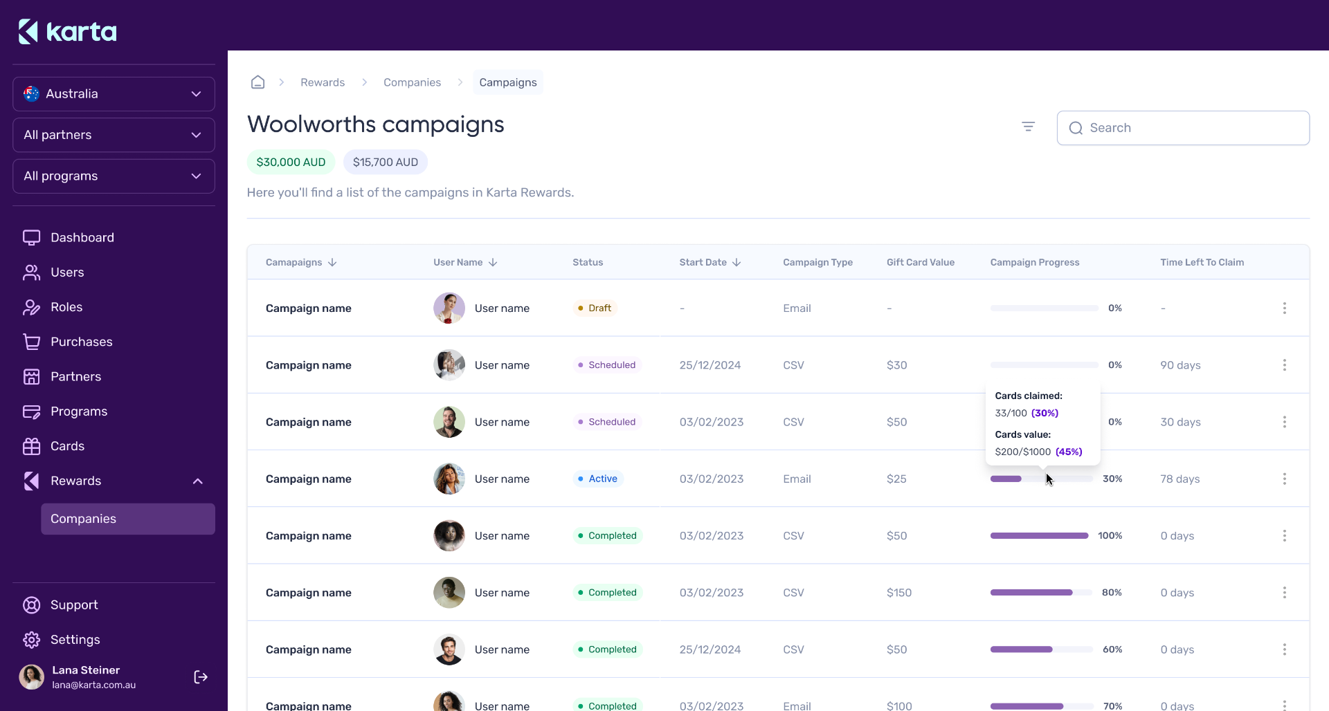
Karta Connect is the internal platform used by Sales and Operations to manage corporate gift card campaigns. It brought orders that previously lived across inboxes and spreadsheets into one shared view, with clear statuses from Pending and Approved to Declined and Inactive.
Designing for colleagues changed my process. With users sitting only a few desks away, I could observe their workflows, test ideas the same day, and iterate every week.
The interface prioritised clarity and density, teams needed to scan, compare and act on many orders at once.
Outcomes
From manual operations to self-service
Orders were handled through phone calls, emails and spreadsheets.
Customers could create and manage campaigns independently, while internal teams operated from the same connected system.
60%
less time spent on operational tasks
By moving repetitive order management into the platform, the team reduced time spent on operational work by 60%, giving them more time to focus on prospecting, client relationships and growth.
Learnings
Proximity to users accelerated better decisions.
Working directly with Sales and Operations helped me test assumptions quickly and refine workflows week by week.
Design the system before the screens.
Defining one shared structure first kept the customer portal and internal platform connected without forcing them to behave the same way.
Constraints can become product rules.
Turning Mastercard requirements into templates and safe zones reduced ambiguity for customers and helped prevent avoidable approval errors.